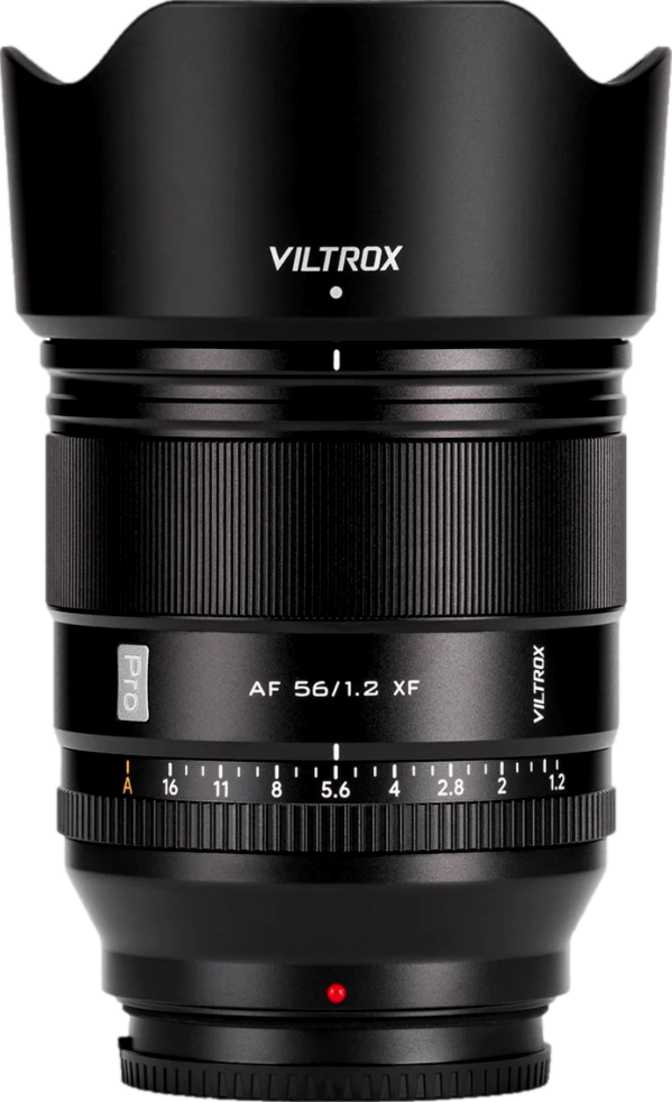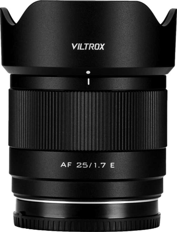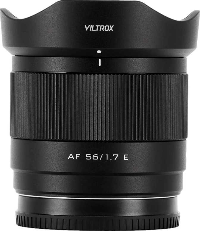
Viltrox AF 56mm f/1.7 Reviewed: Honest Look at a Sony Portrait Prime
Camera LensesThe gap between a kit zoom and a serious fast prime has historically required either a large budget or a willingness to sacrifice autofocus. The Viltrox AF 56mm f/1.7 occupies exactly the space where those two compromises meet: fast enough for serious low-light and background separation work, light enough that you'll actually carry it daily, and priced well below the category's premium options. This review cuts through the spec sheet to tell you what this lens actually delivers in practice — and whether it deserves a place in your bag.
Build Quality: Small Body, Serious Construction
At 170 grams, the Viltrox AF 56mm f/1.7 weighs less than a medium-sized apple. Picked up for the first time, it feels almost misleadingly light — but the all-metal barrel and metal lens mount quickly signal that the build is not a cost-cutting measure. There is a solidity to the construction that inspires confidence, particularly in the mount interface, which is where third-party lenses most commonly show their budget origins with plastic tolerances. Here, there is no play, no rattle.
Splash resistance is built in — the lens can handle light rain and dusty conditions without special care. This will not turn a dry-weather shooter into a water-sports photographer, but for street photographers and outdoor portrait work, having that modest environmental protection adds genuine peace of mind. Just ensure your Sony body offers similar sealing if you intend to shoot in wet conditions regularly; the lens is only as protected as the weakest link in the system.
The front element does not rotate during autofocus — a detail that matters more than it might seem. Polarizing filters and graduated ND filters require a precise orientation, and if the front element spins during focusing, you have to re-adjust the filter with every shot. With the 52mm non-rotating front element here, attaching these common filters is genuinely practical. The 52mm filter size is also widely available and affordable, unlike the larger threads found on faster, bulkier lenses.
All-metal barrel and lens mount with tight tolerances — no plastic, no flex at the body interface
Handles light rain and dusty conditions for confident outdoor use alongside a sealed body
Set your polarizer orientation once — it stays put through every focus adjustment
Ships in the box — not a paid accessory as with many lenses in this category
The 56mm Perspective: What This Focal Length Actually Gives You
On an APS-C Sony body — the a6700, a6600, a6400, or any of the crop-sensor ZV-E models — 56mm translates to a field of view equivalent to roughly 84mm on a full-frame camera. The angle of view just under 30 degrees confirms this: you are firmly in portrait telephoto territory.
Field of View at a Glance
On APS-C Sony bodies, 56mm produces an approximately 84mm full-frame equivalent field of view — solidly in the short telephoto portrait range. With an angle of view of 29.8 degrees, this is a deliberate, selective focal length, not a wide or all-purpose one.
That matters enormously for how you use this lens. At 84mm equivalent, facial features compress slightly and flatteringly compared to wider focal lengths. You can stand at a comfortable distance from your subject — close enough to interact naturally, far enough to create spatial separation — and the background will appear more compressed and out-of-focus than at 35mm or 50mm equivalents. Candid street portraits, environmental headshots, and tightly framed solo subjects are all natural fits.
This is not a wide-angle lens, and it is not a macro lens. If you are buying your first prime expecting versatility from a single focal length, be prepared to use your feet to frame shots — there is no zoom here, by definition.
The f/1.7 Aperture: What Wide Open Actually Buys You
f/1.7 is an unusual stop in a market where most fast primes land at either f/1.4 or f/1.8. It sits fractionally faster than f/1.8 — about a fifth of a stop difference, which is noticeable in measurement but subtle in practice. The gap between f/1.7 and f/1.4 is more meaningful, representing roughly two-thirds of a stop. Here is what the aperture delivers across three distinct dimensions:
Low Light Performance
At indoor events, in overcast conditions, or when light drops fast toward dusk, the wide aperture lets you maintain a shutter speed fast enough to freeze motion without pushing ISO into noise-heavy territory. The wide aperture buys time and flexibility a kit zoom simply cannot match.
Background Separation
At a typical portrait distance of one to two meters, f/1.7 at this focal length produces a noticeable, pleasing separation between subject and background. It is not the razor-thin depth of field of a fast full-frame lens, but for APS-C portrait work, the subject isolation is convincing and flattering.
Bokeh Quality
Nine curved aperture blades keep the opening nearly circular as you stop down. Background highlights render as smooth, round circles across a wide aperture range — not just wide open. This level of bokeh character is typically associated with more expensive optics and rarely appears at this price tier.
For video work, f/1.7 also allows shooting in ambient light conditions where a faster shutter is needed to comply with the 180-degree shutter rule, without forcing ISO up excessively. The lens stops down to f/16 at its minimum, giving full creative control over depth of field in any lighting condition.
Autofocus: Fast, Silent, and Properly Flexible
The lens has a purpose-built autofocus motor, and it operates fully silently. This is non-negotiable for video — a noisy AF motor is picked up by on-camera microphones and ruins otherwise clean audio. For stills shooters, silent AF is equally valuable in settings where noise draws attention: wedding ceremonies, gallery spaces, conference rooms, wildlife at close range.
Full-time manual focus override means you can take control of focus at any moment by simply turning the focus ring, without flipping a switch or navigating a menu. For portrait photographers who want to fine-tune focus position after the camera has locked, or for video operators executing deliberate focus pulls, this works naturally and responsively.
On-camera microphones do not pick up focus noise — fully suitable for video production
Grab the focus ring at any moment — no mode switch or menu required to take manual control
Comfortable for tight headshots — fills an APS-C frame with a face at closest focus
Sharp focus at any distance — keeps the lens useful for occasional landscapes or distant subjects
One Honest Gap: Stabilization
No Optical Image Stabilization
This lens has no built-in OIS. On Sony bodies with in-body stabilization — the a6600, a6700, and recent ZV-E series models — the camera compensates effectively. On non-stabilized bodies, this gap becomes a real practical consideration for handheld shooting in low light or for video work.
On stabilized Sony APS-C bodies, the absence of lens OIS is rarely felt. On bodies without stabilization — the a6400, the original ZV-E10, and older APS-C Sony cameras — the situation changes. Without body-based compensation, you are working with an unsteadied system at a focal length that, in full-frame equivalent terms, behaves like an 84mm lens.
As a general guideline, keep handheld shutter speeds at or above 1/100 second on a non-stabilized body to avoid motion blur from camera movement. The f/1.7 aperture helps considerably by allowing faster shutter speeds in available light, but in genuinely dim conditions, the trade-off becomes apparent. For handheld video on a non-stabilized body at this focal length, external support is strongly advisable.
Who This Lens Is For — And Who Should Look Elsewhere
Ideal For
Portrait and People Photography
The focal length flatters faces, the aperture produces subject separation, and the silent AF makes working with non-photographer subjects feel unobtrusive. Street portraits, lifestyle sessions, headshots, and candid event photography are all natural territory for this lens.
Video and Content Creation
For solo creators filming talking-head content or short-form videos, a fast 56mm on APS-C produces the flattering background-blurred look associated with expensive camera setups. The silent motor means focus tracking will not contaminate audio recordings.
Street Photography
The telephoto-equivalent field of view lets you work from a comfortable distance for candid moments. Compact size and light weight keep the kit discreet. The splash protection handles unpredictable outdoor conditions without hesitation.
Studio and Controlled Environments
In controlled lighting, where the wide aperture is used for subject separation rather than light gathering, this lens performs well. The lack of OIS is irrelevant when the camera is mounted on a tripod.
Look Elsewhere If...
-
Close-up or macro photography is a priority — the minimum focus distance and modest magnification ratio fall short of what true close-up work demands.
-
You shoot primarily landscapes or architecture — 56mm is too narrow a field of view for scenes that require environmental context.
-
You are a full-frame Sony shooter — the optics are calibrated for APS-C sensor coverage and are not intended for full-frame use.
-
Optical stabilization in the lens is required because your body lacks IBIS — the absence of OIS is a genuine handicap in low light on non-stabilized cameras.
Competitive Positioning: Where This Lens Fits in the Market
The APS-C portrait prime market on Sony E-mount has a clear ladder structure. At the affordable end sit manual-focus-only alternatives from various third-party brands — workable but frustrating for portrait work where missed focus on an eye ruins an otherwise perfect frame. The Viltrox 56mm f/1.7 steps clearly above that tier by offering genuine autofocus at a price point that remains accessible.
Above this lens sits the Sigma 56mm f/1.4, a well-regarded option that offers a slightly wider aperture and a strong optical reputation, but at substantially greater cost and weight. The aperture difference between f/1.4 and f/1.7 is meaningful in the most demanding low-light conditions, but for the majority of portrait shooting scenarios the practical gap narrows considerably.
Sony's own 50mm f/1.8 occupies similar focal-length territory on APS-C, providing roughly 75mm equivalent rather than 84mm equivalent. The Viltrox 56mm f/1.4 exists as a sibling product at the same focal length with a wider maximum aperture — buyers who need every last fraction of a stop will find it worth considering, while those making a value judgment may find the f/1.7 the stronger practical proposition.
| Feature | Viltrox AF 56mm f/1.7 | Budget Manual Primes | Premium Fast Primes |
|---|---|---|---|
| Autofocus | Yes — silent motor | Typically none | Yes |
| Max Aperture | f/1.7 | f/1.4 – f/1.8 | f/1.4 |
| Weather Protection | Splash resistant | Generally none | Varies by model |
| Aperture Blades | 9 rounded | 7 – 9 | 9 – 11 |
| Front Element | Non-rotating | Varies | Generally non-rotating |
| Build Weight | Lightweight | Lightweight | Heavier |
| Price Tier | Mid-budget | Budget | Premium |
What It Gets Right and Where It Genuinely Compromises
What It Gets Right
The nine-blade rounded aperture is the kind of detail that matters over thousands of shots — background rendering at f/2, f/2.8, and beyond stays smooth and circular, which is more than many lenses at this price point can honestly claim.
The splash-resistant build adds a layer of reliability that changes outdoor shooting behavior in a tangible way. The non-rotating front element, while invisible in use, is one of those features you only miss when it is absent. Together they signal that practical real-world use was a design priority, not an afterthought.
The 170-gram weight means attaching this lens changes the feel of your compact Sony APS-C body far less dramatically than most fast primes do — a genuinely meaningful quality-of-life factor for all-day carry.
The autofocus motor deserves particular mention for what it is not: loud. Silent AF is standard in premium lenses but still a meaningful surprise in the mid-budget tier, and it opens video use cases that a noisy motor would permanently close off.
Where It Compromises
The minimum focus distance of 55 centimeters is adequate for tight portrait headshots but rules out close-up detail work. The magnification ratio is firmly in the portrait and general-use zone — do not expect to fill the frame with a flower, an insect, or a small product.
The lack of optical image stabilization is the other limitation that buyers must factor in honestly. On bodies with in-body stabilization, it is a non-issue. On non-stabilized bodies, it creates a ceiling on handheld shooting performance in very low ambient light — a ceiling the wide aperture helps push upward but cannot eliminate entirely.
Questions Buyers Ask Before Purchasing
Verdict: A Compelling Portrait Prime That Earns Its Place
The Viltrox AF 56mm f/1.7 is a thoughtfully executed portrait prime for Sony APS-C shooters who want to work seriously without paying premium prices. It delivers where portrait photography demands it most: a flattering equivalent focal length, convincing background separation, smooth bokeh from nine rounded blades, and silent autofocus that performs in the real world.
The construction quality — metal mount, splash protection, non-rotating front element, manageable weight — exceeds what the price tier typically offers. The missing stabilization is a real consideration for non-IBIS bodies, and the close-focus floor keeps macro work off the table, but neither compromises the lens's core portrait mission. For photographers who shoot people on Sony APS-C, the gap between what this lens costs and what it delivers is large enough to be genuinely surprising.
Buy It If You...
- Shoot portraits, lifestyle, or events on a Sony APS-C body
- Create video content and need silent, camera-audio-safe autofocus
- Want fast-prime aperture performance without premium pricing
- Value metal build quality and field-ready splash protection at this tier
Look Elsewhere If You...
- Need close-up or macro photography capability
- Shoot primarily on a full-frame Sony body
- Require lens-based optical stabilization on a non-IBIS body
- Primarily capture landscapes or wide-perspective subjects