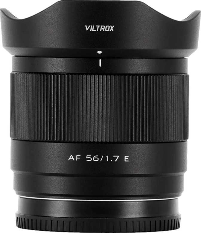
Viltrox AF 25mm f/1.7 Air E: Full Review for Sony APS-C Shooters
Camera LensesSpecifications at a Glance
| Focal Length | 25mm — approx. 37mm full-frame equiv. on APS-C |
| Maximum Aperture | f/1.7 |
| Aperture Blades | 9 — Rounded Design |
| Angle of View | 60° |
| Minimum Focus Distance | 30cm |
| Maximum Magnification | 0.11× |
| Weight | 170g |
| Filter Thread | 52mm |
| Lens Mount | Sony E-Mount |
| Lens Type | Prime — Fixed Focal Length |
- Autofocus via Sony E-mount with full-time manual override
- 9 rounded aperture blades for smooth, circular bokeh highlights
- Sub-200g build that preserves the compact-system advantage
- Common 52mm filter thread for easy accessory consolidation
- Full infinity focus for landscapes and architecture
- No weather sealing — avoid rain, dust, and wet environments
- No optical image stabilization — camera IBIS required if needed
- APS-C sensor only — full-frame bodies require crop mode
Why APS-C Sony Shooters Are Taking Notice
The Sony APS-C mirrorless ecosystem has long occupied the sweet spot for photographers who want capable, compact cameras without the cost and bulk of full-frame systems. But that advantage has a persistent weak point: fast prime lenses for these cameras have traditionally come in two unappealing flavors — either affordable but entirely manual, or autofocus-capable but large enough to defeat the point of a compact body. The Viltrox AF 25mm f/1.7 Air E is a calculated attempt to close that gap, and the approach starts with something that surprises most people who pick it up.
This is a small, single focal-length lens that opens wide enough to shoot in challenging light, delivers background separation that zoom lenses can only gesture at, and weighs so little you’ll forget it’s in your bag. But light and affordable can mean many things. The sections below break down what the f/1.7 Air E actually offers — and equally important, where it pulls its punches.
Build Quality and Physical Experience
A Lens That Disappears on the Camera
At 170 grams, the Viltrox AF 25mm f/1.7 Air E shifts the physical balance back to the camera body — a rare quality in a fast prime. Most lenses with apertures in this range weigh considerably more, and the difference is immediately felt when mounting this lens to a compact Sony APS-C body. Instead of the body hanging off the lens, the whole kit feels unified and intentional.
The “Air” designation in the product name signals Viltrox’s design intent clearly: this is the stripped-back, travel-forward variant of their prime lens family. Compact, light, and built to complement the small-body advantage rather than erase it.
The 52mm filter thread is a genuine practical benefit that often goes unmentioned. It is one of the most common filter diameters across compact lenses, meaning a single set of UV, polarizer, or ND filters can serve multiple lenses without adapters or duplicates. For photographers building a filter kit around a compact system, 52mm is a sensible standard to consolidate around.
The Weather Sealing Question
There is no weather sealing on this lens. For most photographers shooting in typical conditions — indoors, in cities, on fair-weather days — this will never come up. But for those who regularly work in rain, near water, or in dusty environments, it is a real limitation rather than a theoretical one.
Physical Quick-Reference
- Weight
- 170g
- Filter Thread
- 52mm
- Series
- Air — Compact & Lightweight
- Weather Sealed
- No
- Optical Stabilization
- No
Understanding the Field of View: What 25mm Actually Means
On a Sony APS-C camera — which has a sensor 1.5 times smaller than a full-frame — a 25mm lens produces a field of view equivalent to roughly 37–38mm on full frame. That specific range matters more than the number itself.
This is what photographers call a “near-normal” perspective. Slightly wider than a classic 50mm standard, but without the spatial compression that comes with longer focal lengths. In practice, it occupies a very versatile middle ground that becomes more valuable the longer you shoot with it.
Street & Documentary
Captures scenes naturally, without the exaggerated perspective distortion of wider lenses. Subjects appear as they do to the naked eye.
Travel Photography
Wide enough to include environmental context without going conspicuously wide. Comfortable in a minimalist travel kit.
Indoor & Lifestyle
Comfortable in moderately sized rooms while allowing meaningful subject separation from cluttered backgrounds.
Environmental Portraits
Strong for showing a subject in context. Effective for storytelling portraits that place people within their surroundings.
Using this lens on full-frame Sony bodies: The E-mount is shared across Sony’s APS-C and full-frame cameras, but this lens’s image circle is sized for APS-C sensors. On a full-frame body, APS-C crop mode would be required, which significantly reduces the sensor’s effective resolution. This lens is designed and optimized for APS-C use.
The f/1.7 Aperture: More Than a Low-Light Tool
What This Speed Actually Delivers
An f/1.7 maximum aperture sits in a genuinely capable tier of light gathering. Compared to the f/3.5–5.6 range typical of kit zoom lenses, it admits roughly three to four times more light under equivalent conditions. That is not a marginal difference — it changes what is possible.
-
Dim indoor settings
Cafes, events, and home interiors — shutter speeds stay fast enough to freeze motion without pushing ISO into visibly noisy territory.
-
Dusk and overcast conditions
Natural light that forces a kit zoom to struggle keeps this lens in a comfortable operating range.
-
Well-lit conditions
Lower ISO values produce cleaner files with finer detail retention. The fast aperture pays dividends even in good light.
-
Natural-light video
Filming in environments where adding lights is impractical becomes consistently more achievable at f/1.7.
Nine Rounded Blades and Bokeh Quality
The lens uses nine aperture blades shaped with curved rather than straight edges. This matters for the shape of out-of-focus highlights — bright spots from light sources, reflections, or specular elements render as circles rather than geometric polygons when the aperture is open.
Nine rounded blades at f/1.7 produces smooth, organic background blur. The transition between sharp foreground and blurred background feels gradual rather than harsh, and the blur itself remains visually clean through the focus-to-blur zone.
Five or seven straight-edged blades produce noticeably polygonal out-of-focus highlights. Nine rounded blades maintain circular highlights further into the aperture range. The difference is most visible against bright, specular backgrounds — light sources, reflections, or water surfaces.
Autofocus and Focus Control
Autofocus Capability
The “AF” in the lens name indicates autofocus support through Sony’s E-mount communication system. Paired with full-time manual focus override, the lens allows either the camera to handle focus acquisition or the photographer to take over the focus ring at any point — without toggling between modes.
Full-time manual override is particularly useful for video creators who need precise, tactile focus control during a shot, or for still photographers who want to quickly fine-tune focus after the camera acquires an initial lock.
On autofocus performance: AF speed, tracking accuracy, and phase-detection behavior require hands-on testing to verify. The specification data does not include these metrics, so this review will not speculate. What is established is that E-mount communication is a mature, well-supported standard across the Sony APS-C ecosystem.
Minimum Focus Distance in Real Terms
The closest this lens can focus is approximately 30 centimeters — roughly the distance from fingertips to elbow when the arm is bent. Close enough for food photography, product tabletop setups, and fine environmental detail, but not close enough for true macro work.
At its closest focus point, this lens captures subjects at roughly one-tenth of their actual size — a reproduction ratio well suited to general photography but far short of the half-life-size magnification or greater that dedicated macro lenses provide.
The lens can also focus from that close minimum all the way to infinity, which matters for landscape, architecture, and any situation where distant subjects need critical sharpness.
Who This Lens Is For — and Who Should Look Elsewhere
-
Everyday and street photographers on Sony APS-C
A near-normal field of view, fast aperture, and minimal weight make this a compelling everyday carry lens — the kind you leave on the camera until a specific situation demands otherwise.
-
Travel photographers
Adds almost nothing to the bag in bulk or weight, yet dramatically expands capability beyond what a kit zoom offers in low light or when subject separation matters.
-
Photographers stepping up from a kit zoom
A fast prime changes how you think about composition and light. You move your feet instead of adjusting a zoom ring, which reshapes compositional instincts in a way no zoom teaches as effectively.
-
Content creators and vloggers
Shooting in mixed or challenging light benefits from consistent aperture headroom, particularly when filming in environments where adding lights is impractical.
-
Action and sports photographers
Fast, unpredictable subjects require verified AF tracking data. The specification sheet for this lens does not confirm tracking speed or accuracy under demanding conditions.
-
Photographers working in variable weather
The absence of weather sealing is a real operational constraint. No sealing means no protection in rain, mist, or dust — and damage falls outside the lens’s intended use case.
-
Macro and close-up specialists
A 0.11× reproduction ratio is adequate for general detail photography but falls well short of what dedicated macro lenses achieve. Ultra-close magnification is not this lens’s domain.
-
Full-frame Sony shooters
Full-frame use without crop mode produces visible vignetting. In crop mode, you sacrifice most of the resolution advantage of a full-frame body. This lens is engineered for APS-C.
How It Compares to the Alternatives
The Viltrox AF 25mm f/1.7 Air E competes in a defined segment: autofocusing fast primes for Sony APS-C. The table below positions it against the most logical alternatives a buyer in this category would consider.
| Factor | Viltrox AF 25mm f/1.7 Air E | Manual Budget 25mm Options | Sony-Branded APS-C Primes | Full-Frame E-Mount Primes (Crop Mode) |
|---|---|---|---|---|
| Autofocus | Yes | No | Yes | Yes |
| Max Aperture | f/1.7 | Typically f/1.8 | f/1.8 – f/2.8 | f/1.4 – f/2.8 |
| Weight | 170g | Similar or lighter | Varies | Significantly heavier |
| Weather Sealing | No | No | Select models only | Some models |
| Filter Thread | 52mm | Varies | Varies | Typically 55–67mm |
| Target Sensor | APS-C | APS-C | APS-C | Full Frame |
| Bokeh Blades | 9, rounded | 7–9, varies | 7, varies | 9–11, varies |
Comparison based on published category specifications and general market positioning. Individual models within each category will vary.
Honest Assessment: Strengths and Compromises
Where It Earns Its Place
The clearest strength here is the specific combination this lens achieves simultaneously: autofocus, a wide f/1.7 aperture, nine rounded aperture blades, and a sub-200-gram weight. Lenses that offer two or three of these qualities are common. Offering all four in a single package is the core argument for this lens, and it is a coherent one.
-
Nine rounded blades deliver real optical character.
Budget primes with fewer or straight-edged blades cannot match the smooth background rendering that nine rounded blades provide. For photographers who care about the quality of blur rather than just its presence, this is a meaningful differentiator at this price tier.
-
The 170g weight is genuinely enabling.
A lens this light changes how photographers think about kit composition. It invites carrying rather than requiring a deliberate decision about whether it is worth including that day.
-
The 52mm filter thread adds quiet, practical value.
Consolidating around 52mm filters is cost-effective and sensible for compact-kit photographers. Filters are affordable at this size and widely shared across similar focal lengths.
Where It Asks for Acceptance
The lens’s limitations are consistent with its design intent. None are hidden or surprising, but each deserves honest acknowledgment before purchase.
-
No weather sealing is a genuine constraint for some users.
Expected at this class and size, but a real operational limit for photographers who work outdoors in variable or harsh conditions.
-
No optical stabilization requires contextual awareness.
At this focal length with a fast aperture, stabilization is rarely critical — short focal lengths resist camera shake naturally. Photographers using bodies without IBIS should factor this in for handheld video or very low shutter speed situations.
-
The close-focus ceiling is a defined boundary.
A 0.11× magnification ratio means the lens has a clear ceiling on rendering small subjects. This is a characteristic of the design class, not a flaw — but it is a boundary worth knowing before purchase.
Questions Buyers Ask Before Purchasing
Our Verdict
The Viltrox AF 25mm f/1.7 Air E earns its place in a Sony APS-C kit by solving a specific and genuine problem: delivering an autofocusing, fast-aperture prime in a package that does not undermine the compact character of the system it serves.
This is not a universal lens. It lacks weather sealing, optical stabilization, and macro capability. Its autofocus performance under demanding tracking conditions is unverified by the available specification data. These are honest constraints, not abstractions.
But for the photographer building or refining a light, capable Sony APS-C kit — one who shoots frequently in mixed or low light, values subject isolation as a creative tool, or is ready to move beyond the limitations of a kit zoom — this lens fills a role that few alternatives fill as cleanly at this physical size.
You shoot Sony APS-C and want a light, fast everyday prime for street, travel, content creation, or low-light work. This lens makes a compelling case as a permanent first-choice lens on the camera.
Weather sealing, verified autofocus tracking for action subjects, or close-up macro magnification are non-negotiable requirements for your work. There are better-matched tools for those specific demands.