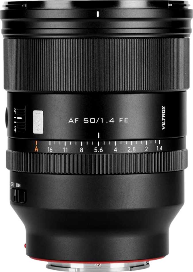
Viltrox AF 50mm f/1.4 Pro FE: Full Review for Sony E-Mount Shooters
Camera LensesThe 50mm focal length has been called the "nifty fifty" for decades, and for good reason. It sees the world at roughly the same angle of view as the human eye, making it one of the most versatile focal lengths a photographer can own. The Viltrox AF 50mm f/1.4 Pro FE enters this fiercely competitive space not as a budget placeholder, but as a serious optical instrument built for Sony E-mount shooters who want f/1.4 light-gathering capability without paying flagship-brand prices.
Whether you are coming from a kit lens and making your first prime purchase, or you are a working photographer weighing your options against first-party glass, this lens has a specific and compelling argument — one worth examining carefully before spending your money.
Key Specifications at a Glance
What the numbers actually mean for your photography
Build Quality and Physical Design
Construction and Materials
The Viltrox AF 50mm f/1.4 Pro FE is a substantial lens. At 800 grams, it is heavier than most casual shooters expect from a 50mm prime — this is not a pocket-friendly walk-around lens in the vein of older, optically simpler designs. That weight is a direct result of the optical complexity and materials involved. The mount is metal, which matters for long-term durability: a metal mount resists wear and maintains a consistent, play-free connection to your camera body far longer than plastic alternatives.
Handling in Practice
The front element does not rotate during focusing — a detail that sounds minor until you have tried to use a circular polarizer on a lens where it does. On rotating-front designs, every focus adjustment ruins your filter orientation. Here, your filter stays exactly where you set it, which is a genuine practical benefit for landscape, architectural, and street photographers who rely on filtration regularly.
A lens hood is included in the box, keeping flare in check under high-contrast lighting and providing physical protection for the front element from accidental contact.
The Weight Question
800 grams on a Sony mirrorless body creates a front-heavy system, particularly on compact bodies like the A7C series or the ZV-E1. For studio work, portrait sessions, or deliberate street shooting, the weight is manageable. For all-day travel photography where the camera hangs around your neck for eight hours, you will notice it. Pairing this lens with a larger-gripped body like the A7 IV or A9 series creates a significantly more balanced feel in hand.
Optical Performance: What f/1.4 Actually Means
Light Gathering and Low-Light Capability
The f/1.4 maximum aperture lets in approximately four to five times more light than a standard kit zoom at its widest setting. In practical terms, that means shooting in dimly lit restaurants, candle-lit events, or poorly lit indoor venues without pushing your ISO into noise-heavy territory. Evening portraits at golden hour become workable without flash. For photographers accustomed to shooting at f/5.6 or f/6.3 on a zoom, opening to f/1.4 represents a transformational shift in how the camera responds to available light.
Depth of Field and Background Separation
At f/1.4 focused at typical portrait distances, the depth of field is extremely shallow — subjects appear in sharp focus while backgrounds dissolve into soft, out-of-focus blur. The quality of that blur is shaped by the nine rounded aperture blades, which produce consistently circular, smooth bokeh highlights. Compared to lenses with five or six straight blades that create angular, polygonal highlight shapes, this results in more natural and pleasing background rendering — exactly what portrait and event photographers look for.
The full aperture range — from f/1.4 for maximum subject isolation to f/16 for near-total depth of field — covers everything from intimate close-up portraits to sweeping landscape and architectural shots where every element needs to be sharp.
Angle of View
The 46.6-degree field of view sits squarely in the "natural" zone — close to how the human eye perceives a scene without compression or distortion. Wide enough to include environmental context in a frame, but not so wide as to distort facial features at close range. This versatility makes it well-suited for environmental portraits, street scenes, food photography, and documentary-style work alike.
Low-Light Advantage
f/1.4 admits four to five times more light than a typical kit zoom at f/4–f/5.6. This means lower ISO settings, less digital noise, and cleaner images in dim environments — all without resorting to flash or a tripod.
Bokeh Quality
Nine rounded blades keep bokeh highlights circular and smooth even at intermediate apertures like f/2 or f/2.8, where lesser lenses begin showing distracting polygonal shapes behind the subject.
Autofocus: Speed, Silence, and Reliability
Focus Motor Performance
The lens contains a built-in focus motor, meaning autofocus does not depend on the camera body's internal drive mechanism. This ensures correct operation across every Sony E-mount body that supports electronic communication, including older models that predate body-driven autofocus systems.
The motor is designed specifically to run without audible noise. For video, this is essential: a mechanical focus hum picked up by the camera's microphone ruins audio takes. For quiet shooting environments — ceremonies, conferences, intimate events — a noisy lens is disruptive to everyone around you. The silent motor eliminates both concerns in one design decision.
Minimum Focus Distance and Close-Up Work
The lens focuses as close as 45 centimeters from the camera's image sensor. At that distance with the aperture fully open, you can isolate a relatively small subject against a softly blurred background. The 0.11x magnification ratio makes clear, however, that this is not a macro lens — it renders subjects at roughly one-ninth their actual size on the sensor. For tight head-and-shoulders portraits and moderate product photography, this minimum distance is entirely practical. For insects, coins, or ring jewelry, a dedicated macro lens is the appropriate tool.
Key Features Explained
- f/1.4 Maximum ApertureDramatically improves low-light shooting ability and enables strong subject-background separation unavailable on slower lenses.
- Nine Rounded Aperture BladesProduces smooth, circular bokeh highlights preferred for portrait and event photography — even at intermediate aperture settings between f/1.4 and f/4.
- Silent Internal Focus MotorCritical for video recording and quiet environments where mechanical focus noise would contaminate audio or disturb subjects and bystanders.
- Non-Rotating Front ElementAllows circular polarizers and graduated ND filters to remain perfectly oriented throughout the entire focusing process without constant correction.
- Metal Lens MountEnsures structural durability and consistent mounting alignment over years of regular use — a meaningful advantage over plastic mount designs.
- 77mm Filter ThreadMatches the thread size of many professional telephoto and fast zoom lenses, enabling filter sharing across multiple lenses in your kit.
- 45cm Minimum Focus DistanceEnables useful close-up work for portraits and product photography without requiring a dedicated macro lens for typical shooting scenarios.
- Lens Hood IncludedControls flare in high-contrast lighting and provides physical protection for the front element from accidental contact in the field.
Important Limitations to Know Before Buying
Two absent features are worth naming directly — they will matter significantly for some buyers and be entirely irrelevant to others.
No Optical Image Stabilization
The lens has no built-in stabilization system. Handheld shooting in low light requires either fast enough shutter speeds to prevent camera shake, or reliance on your body's in-body image stabilization (IBIS). Most modern Sony full-frame bodies — the A7 III, A7 IV, A7R V, and the A9 series — include IBIS that compensates effectively. Shooters using bodies without IBIS, common on some APS-C and video-focused models, will need to be more deliberate about minimum shutter speed in dim conditions.
No Weather Sealing
The lens carries no splash or dust resistance. Using it in rain, near waterfalls, on dusty trails, or in other challenging outdoor conditions carries real risk of moisture or particle ingress into the optical assembly. For controlled environments — studios, indoor events, and city streets on clear days — this is entirely non-issue. For outdoor adventure, wildlife, or travel photographers who regularly work in unpredictable weather, this limitation may be a firm dealbreaker.
Who Is This Lens For?
Strong Fit If You...
- Shoot portraits, events, street photography, or documentary work on Sony E-mount
- Want significantly better low-light performance than a standard zoom can provide
- Shoot video and need silent autofocus that will not contaminate your recorded audio
- Use circular polarizers or ND filters and value a non-rotating front element
- Are building a kit around one versatile fast prime rather than a range of slower zooms
Think Carefully If You...
- Regularly shoot in rain, dust, or harsh outdoor conditions where weather sealing is essential
- Require true macro capability for insects, coins, stamps, or very small product photography
- Use a Sony body without in-body stabilization and frequently handhold in very dim environments
- Prioritize compact, lightweight carry over optical capability — 800 grams is a serious commitment
- Already own Sony G Master or Zeiss 50mm glass and expect a meaningful optical step forward
How It Compares to the Alternatives
The Viltrox 50mm f/1.4 Pro occupies a specific mid-range position in the Sony E-mount prime market — below first-party flagship pricing but well above entry-level optics in ambition and specification.
| Feature | Viltrox AF 50mm f/1.4 Pro FE | Sony FE 50mm f/1.8 | Sony FE 50mm f/1.4 G Master |
|---|---|---|---|
| Maximum Aperture | f/1.4 | f/1.8 | f/1.4 |
| Aperture Blades | 9 | 9 | 11 |
| Weather Sealing | No | No | Yes |
| Built-in OIS | No | No | No |
| Filter Thread | 77mm | 49mm | 67mm |
| Weight | 800g | 186g | 516g |
| Silent AF Motor | Yes | Yes | Yes |
| Price Tier | Mid-range | Entry | Premium |
Comparison based on published specifications. Prices and availability vary by region and retailer.
An Honest Assessment
The Viltrox AF 50mm f/1.4 Pro FE gets a lot right. The core optical proposition — a wide-aperture prime with nine rounded aperture blades, silent autofocus, and a non-rotating front element — is coherent and genuinely useful for the photographers it targets. The metal mount inspires confidence in long-term durability, and the included lens hood is a welcome practical inclusion that not every manufacturer provides.
The weaknesses are real, not theoretical. Weight is the most significant practical limitation for any shooter who values portability. At 800 grams, this lens is heavier than the Sony G Master it competes against on price — an unusual reversal worth acknowledging plainly. The lack of weather sealing reflects a deliberate cost trade-off, but it restricts versatility for photographers who regularly work outdoors.
The absence of optical stabilization is less concerning than it once was given how capable Sony's in-body stabilization has become on modern mirrorless bodies. But it remains relevant for shooters on older or entry-level platforms where IBIS is limited or absent.
What you are ultimately getting is a lens built around one core strength: maximum aperture optical capability at a price below the first-party flagship option. If that trade-off maps to your actual shooting priorities, the argument is compelling.
Genuine Strengths
- f/1.4 aperture at a mid-range price point
- Nine rounded blades for quality background blur
- Genuinely silent autofocus motor for video work
- Non-rotating front element for filter users
- Durable metal mount construction
Real Weaknesses
- Very heavy for a standard 50mm prime
- No weather or splash resistance
- No built-in optical image stabilization
Frequently Asked Questions
Final Verdict
Our recommendation for Sony E-mount photographers
The Viltrox AF 50mm f/1.4 Pro FE is a serious lens for Sony E-mount photographers who want wide-aperture prime performance without paying first-party flagship prices.
It delivers on the fundamentals that matter most: a genuinely fast aperture, smooth nine-blade bokeh, silent autofocus for video and quiet shooting environments, and solid physical construction with a metal mount and non-rotating front element.
Its limitations — weight, no weather sealing, and no built-in optical stabilization — are real, and the right buyer acknowledges them clearly. If you shoot regularly in variable weather or if portability is your defining priority, look elsewhere. If you shoot portraits, events, street photography, or video in controlled or indoor environments on a Sony mirrorless body, and you want the creative and practical advantages of f/1.4 at a price well below Sony's own flagship offering, this lens earns a confident recommendation.