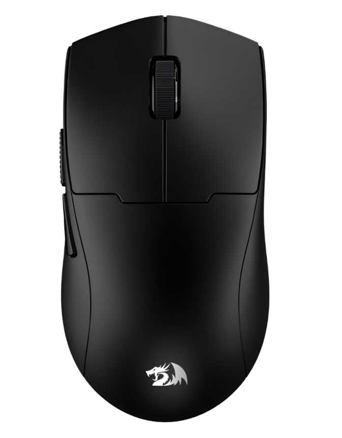
Redragon M817 Klyamoor Pro Review: Ultralight Tri-Mode Wireless Mouse
MiceMost gaming mice make you choose: go wired for reliability, go wireless for freedom, or go Bluetooth for travel. The Redragon M817 Klyamoor Pro refuses to make that compromise on your behalf. It arrives at a budget-friendly price point offering all three connection modes, a body that barely registers on a scale, and a battery that can last through a long weekend without a single thought about charging. That combination is unusual at any price — at this tier, it is close to unheard of.
Whether that translates to a mouse worth buying depends entirely on what you actually need. The M817 Klyamoor Pro has a clear personality, clear limitations, and a specific audience it will genuinely delight. This review covers all three.
At a Glance
Build, Design, and Physical Feel
A Mouse That Disappears in Your Hand
The first thing you notice when you pick up the M817 Klyamoor Pro is how little you notice it. At just 50 grams, it sits in the featherweight tier that premium gaming brands charge a premium to deliver. Mice marketed as "lightweight" often land between 60 and 80 grams — the M817 undercuts that by a meaningful margin.
The body measures 105mm in length and 60mm in width, with a profile that rises to 38mm at its peak. These are compact dimensions, placing it firmly in small-to-medium mouse territory. Large-handed users who prefer full palm grip will feel cramped. For small to medium hands — or those who favor claw or fingertip grip regardless of hand size — the M817's proportions become a quiet advantage: fast, precise directional changes require less wrist travel.
Right-Handed Only. The sculpt is built entirely around the conventional right-hand grip. Left-handed players have no variant to turn to here, and there is no ambidextrous version of this mouse.
Understated Aesthetics
The M817 Klyamoor Pro carries no RGB lighting whatsoever. For buyers accustomed to rainbow breathing effects being non-negotiable in gaming peripherals, this might read as a compromise. In practice, it results in a mouse that looks completely at home on a professional desk or in a work-from-home setup — matte gaming aesthetic without the light show.
The 1.8-metre charging cable is a generous length, reaching from most desk setups to a PC tower or USB hub without strain. There are no extra removable weights and no adjustable inserts. What you get at 50 grams is what you work with — for buyers who enjoy fine-tuning their mouse's heft, this is simply not that product.
- Length
- 105 mm
- Width
- 60 mm
- Profile Height
- 38 mm
- Weight
- 50 g
- Cable Length
- 1.8 m
- Orientation
- Right-Handed
- RGB Lighting
- None
- Adj. Weights
- None
Connectivity: Three Ways to Connect, One Mouse
The M817 Klyamoor Pro offers three distinct connection methods. Understanding what each one does in practice is the key to appreciating what separates this mouse from cheaper single-mode wireless options.
2.4 GHz Wireless
Primary Gaming ModeA dedicated USB dongle broadcasts on a near-interference-free frequency, delivering a connection effectively indistinguishable from wired under everyday gaming conditions. Response is fast, signal dropout is minimal — use this mode when competing or playing anything where reaction time matters.
Bluetooth 5.1
Multi-Device ModeThe modern Bluetooth 5.1 standard is more stable and energy-efficient than older iterations. Pair this mouse to a laptop, tablet, or secondary workstation without occupying a USB port or carrying a dongle — ideal for productivity and multi-device workflows.
USB Wired
Reliability ModeThe 1.8m cable covers scenarios where wireless simply is not preferred — LAN events, restricted RF environments, or when you want absolute zero latency with no battery management involved. The cable also charges the mouse during wired use with no interruption to play.
The M817 Klyamoor Pro stores zero configuration profiles on the hardware itself. Custom button mappings live in software on whichever computer you configured them on. Plugging into an unconfigured machine reverts the mouse to default behaviour — a real consideration for anyone who regularly moves between multiple computers.
Sensor Performance: What the PixArt PAW3311 Really Means
Understanding the Heart of This Mouse
The PixArt PAW3311 is the optical sensor powering the M817 Klyamoor Pro. PixArt is a legitimate and widely respected sensor manufacturer — their higher-end sensors power some of the most revered gaming mice on the market. The PAW3311, however, occupies the entry-level segment of their lineup. That context matters enormously.
In practical terms, the PAW3311 performs predictably and reliably at moderate sensitivity settings. Everyday navigation, casual gaming across most genres, and general productivity use present no problems. The sensor tracks accurately on standard gaming mousepads and most common surfaces without the erratic behaviour found in truly cheap alternatives.
The headline maximum DPI figure is very high — far beyond what any practical gaming or productivity use case requires. Most competitive players operate between 400 and 1600 DPI, and even aggressive high-sensitivity users rarely exceed 3200 for gameplay. At extremely high sensitivity settings, entry-level sensors introduce smoothing and interpolation that reduces precision. The sweet spot for the PAW3311 is well within the mid-range of its sensitivity band — set it there and leave it.
The polling rate operates at the standard 1000Hz, meaning the mouse reports its position to the computer 1,000 times per second. This matches what you find in mice costing three to four times as much and is effectively imperceptible as a limitation under normal gaming conditions.
If you track pixel-width movements and demand sensor perfection, the PAW3311 will eventually reveal its ceiling. Dedicated competitive players building a performance rig should look at mice built around flagship sensors. The M817 Klyamoor Pro is not that mouse — but for the overwhelming majority of gamers, the sensor will not be the limiting factor in their performance.
- Sensor
- PixArt PAW3311
- Minimum DPI
- 1,000
- Maximum DPI
- 24,000
- Polling Rate
- 1000 Hz
- Max Speed
- 300 IPS
- Max Acceleration
- 35G
- DPI Adjustable
Battery Life: The Endurance Story
A wireless gaming mouse that lasts roughly 66 hours on a full charge translates, for most users, to one to two weeks of real-world use before charging becomes a thought. If you game for two to three hours a day, you are looking at over three weeks between charges — significantly longer than you would manage a phone, and long enough that recharging becomes a background task rather than a daily ritual.
This is one of the M817 Klyamoor Pro's genuine standout credentials. Budget wireless mice often prioritise the wireless feature itself over endurance, resulting in mice that need charging every two or three days. The battery capacity here is strong for the class.
The ability to continue using the mouse while it charges is practically important. There is no forced downtime — if you find yourself at critical battery mid-session, plug in the 1.8m cable and keep playing without interruption. The mouse functions as a wired device during charging with no interruption to your session.
Battery Life in Context
Rated wireless battery life
Who This Mouse Is For — and Who Should Look Elsewhere
-
Multi-device users
Anyone who wants one mouse working across a gaming PC, a work laptop, and a secondary machine — the three connection modes make this genuinely practical without buying two separate peripherals.
-
Small-to-medium hand users
Players who benefit from a compact, low-profile shape and appreciate a lightweight mouse that reduces wrist fatigue during long sessions, especially those using claw or fingertip grip.
-
Office-and-gaming hybrids
Users who need a mouse that looks professional at a work desk but performs in evening gaming sessions. The absence of RGB keeps it clean and office-appropriate.
-
Budget-conscious buyers
Anyone entering the wireless gaming space who wants tri-mode connectivity without paying a flagship price for the privilege.
-
Ultralight enthusiasts
Players who prioritise minimal weight above most other factors and do not want to spend premium prices to achieve it.
-
Left-handed users
There is no ambidextrous version and no left-handed variant. This is a non-negotiable limitation with no workaround.
-
Competitive FPS players
Players who chase sensor accuracy at the highest level will reach the PAW3311's ceiling. This mouse is not engineered for precision-critical high-level competitive play.
-
Users who need portable settings
With zero onboard memory, button configurations do not survive a move to an unconfigured machine. Not suitable for frequent multi-PC travel setups.
-
Large-hand palm-grip users
The compact 105mm body will feel short under a full palm grip for users with larger hands. A longer, taller mouse body is required.
-
RGB enthusiasts
The M817 has no RGB lighting and no RGB option. If lighting effects are non-negotiable, this mouse will disappoint.
Competitive Positioning
The M817 Klyamoor Pro sits in a competitive but well-defined bracket: budget tri-mode wireless gaming mice. Here is how it measures up against the logical alternatives a buyer in this range would consider.
| Feature | Redragon M817 Klyamoor Pro | Typical Budget Single-Mode Wireless | Mid-Range Wireless (Single Mode) |
|---|---|---|---|
| Connection Modes | Wired + 2.4GHz + Bluetooth | Wireless only | 2.4GHz only |
| Weight | ~50g (ultralight) | ~80 – 100g | ~70 – 90g |
| Battery Life | ~66 hours | ~40 – 50 hours | ~50 – 70 hours |
| Sensor Class | Entry-level (PAW3311) | Entry-level / proprietary | Mid to high range |
| Onboard Profiles | None | Often none | Sometimes 1 – 5 |
| Use While Charging | Yes | Rarely | Sometimes |
| RGB Lighting | None | Usually present | Usually present |
Honest Strengths and Weaknesses
Fifty grams from a budget wireless mouse is a real engineering achievement. It delivers a measurable reduction in wrist and forearm fatigue over multi-hour sessions — not a minor comfort bonus, but a meaningful physical difference over a long gaming evening or workday.
Most mice at this price ask you to pick one wireless standard. The M817 gives you all three and lets you switch depending on what is most convenient right now. This is a practical advantage for multi-device users that is genuinely hard to find at this cost.
Sixty-six hours outperforms most budget-class competitors and makes charging genuinely infrequent rather than a recurring nuisance that interrupts your setup routine.
The ability to play wired while charging means a dead battery never ends a session. It is a small detail that genuinely matters during long gaming evenings, and one that budget mice regularly skip.
The PAW3311 is reliable within its operating range, but it is not a performance sensor. Precision-demanding users who chase pixel-perfect tracking will find this ceiling before long. This is the trade-off that funds the connectivity and weight advantages at the price.
Zero onboard profiles means your button assignments do not travel with the mouse. A genuine limitation for anyone who rotates between multiple machines or needs plug-and-play configuration portability.
The absence of a left-handed or ambidextrous option locks out an entire segment of the market with no workaround available. It is a hard stop for southpaw users.
One year of manufacturer warranty is the budget-tier baseline, but it leaves longer-term durability as an unanswered question. Premium wireless mice typically offer two to three years of backing.
Common Buyer Questions Answered
Final Verdict
The Redragon M817 Klyamoor Pro is a budget wireless gaming mouse that earns its price with two genuine, tangible strengths: an ultralight 50-gram body and tri-mode connectivity that few competitors at this tier even attempt. If you have been priced out of the ultralight wireless segment by flagship pricing, this is one of the few accessible paths in.
Buy This If...
- You want a genuinely light wireless mouse with practical multi-device support
- You regularly switch between a gaming PC and a work laptop
- You have small to medium hands or prefer claw or fingertip grip
- You want a clean, office-appropriate peripheral with no RGB
- Budget is the primary constraint and connectivity is the priority
Look Elsewhere If...
- You are left-handed — there is no alternative version
- Sensor precision is critical for your level of competitive play
- You need your settings and macros to travel with the mouse between machines
- You have large hands and rely on a full palm grip
- RGB lighting is an expectation, not an optional bonus
It is the right mouse for a small-to-medium-handed user who wants a featherlight, wireless-first peripheral that works across a gaming PC and a work laptop without buying two separate mice. The battery life supports that lifestyle. The weight rewards it. The connectivity enables it.