Panasonic Lumix S 24-60mm f/2.8: Full Review & Real-World Test
Camera LensesKey Specifications at a Glance
The numbers that define what this lens can do in the real world
Most photographers shopping for a fast standard zoom expect to see "24-70mm" on the barrel. Panasonic made a deliberate choice with the Lumix S 24-60mm f/2.8: trim the telephoto reach by 10mm, and in return deliver a lens that is meaningfully more compact and lighter than anything else in its aperture class on the L-mount platform. Whether that trade-off works for you depends entirely on how you shoot — and understanding that decision is the starting point for everything that follows in this review.
What makes this lens genuinely interesting is that Panasonic didn't stop at compactness. The 24-60mm f/2.8 also brings a close-focus capability more commonly associated with dedicated macro lenses, a built-in stabilisation system, and a focusing mechanism so quiet it disappears into silence. These aren't features added to hit a spec-sheet checklist — they reflect a coherent philosophy about what a working lens for the L-mount ecosystem should do.
Build Quality and Physical Experience
Construction and Weather Protection
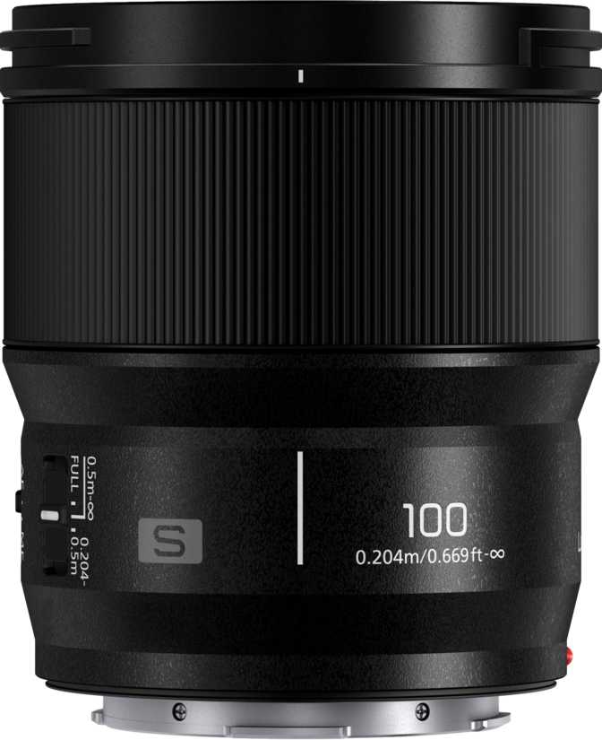
Pick up the Lumix S 24-60mm f/2.8 and the first thing you notice is that 544 grams feels lighter than it has any right to for a constant-aperture f/2.8 zoom. Most comparable fast zooms from other manufacturers hover noticeably above 800 grams. Panasonic has clearly engineered for portability here without resorting to plastic construction to get there.
The mount is machined metal — important not just as a durability marker but because a solid mount is the only interface between a potentially heavy camera body and the optical elements inside. It will not flex, and it will not introduce play over years of heavy use.
The body is weather-sealed throughout, meaning rain, dust, and damp conditions that make outdoor photographers nervous are handled. This is full professional-grade protection — not the token splash-resistance you find on consumer lenses. If you shoot events, travel, or landscapes, this matters practically rather than just as reassurance on paper.
Filters, Hood, and Front Element
The 77mm filter thread is a sweet spot: large enough to accept quality glass with room to breathe optically, and common enough that you likely already own filters in this size if you shoot seriously. The front element does not rotate during focusing or zooming, which means circular polarising filters stay put exactly where you set them. This sounds minor until you've spent time wrestling with a rotating front element in the field.
The included lens hood reverses onto the barrel for compact storage and attaches positively without rattle. Both details suggest Panasonic put thought into how this lens actually gets used rather than just how it looks in marketing imagery.
Practical note for filter users: Because the front element never rotates, you set your circular polariser once and it holds position through the entire shooting session — at any focal length, at any focus distance.
The 24–60mm Focal Range: What You Actually Get
The Wide End: 24mm
At 24mm, the field of view is wide enough to work comfortably in tight interiors, capture environmental portraits that show context, and handle the sweeping establishing shots that travel photography demands. It is not ultra-wide — you won't get the exaggerated perspective of a 16mm or 20mm lens — but it covers genuine creative territory across the most common photographic scenarios.
The 60mm End: The Honest Trade-off
If you regularly shoot subjects at distances where 70mm is your natural reach — portraits where you want extra working distance, sports sidelines, or wildlife at medium range — you will feel the 10mm gap. The compression at 60mm remains pleasing for portraits, but you will occasionally find yourself stepping back to frame a shot you could have taken from where you stood with a 70mm.
Zoom Range in Practice
The 2.5x zoom ratio gives genuine versatility from interior architecture to flattering outdoor portraits within a single lens — no bag changes, no missed moments. Photographers who primarily shoot at the wide end and use the zoom for moderate framing report rarely missing the extra 10mm. For travel and documentary work, the range is comprehensively useful.
Constant f/2.8: The Aperture That Stays Put
A constant maximum aperture throughout the zoom range sounds like a technical specification. In practice, it changes how you work.
Variable-aperture zooms — which cover most budget and mid-range options — automatically force you to a smaller aperture as you zoom in. This means your shutter speed must drop or your ISO must rise as you reach toward the telephoto end, often exactly when you need both speed and clean images: shooting a subject moving away from you, or working in fading golden-hour light.
With this lens, the aperture holds at f/2.8 whether you're shooting at 24mm or 60mm. Every exposure calculation you make at the wide end remains valid as you zoom. For photographers who shoot in changing light — events, documentary work, travel — this consistency is practically freeing.
Nine rounded aperture blades produce the circular blur shapes in out-of-focus areas that photographers and portrait clients prefer. At f/2.8, backgrounds dissolve without the harsh, distracting outlines that fewer, straighter blades produce.
The lens stops down to f/22 for maximum depth of field when you want every element sharp — covering technical architectural work and landscape photography at one extreme, and tight subject isolation at the other.
Optical Image Stabilisation in Practice
Built-in optical stabilisation corrects for camera movement before light ever hits the sensor. In practice, this means cleaner handheld shots in dim light — the kind of performance gap that becomes visible when you examine images at full resolution.
For photographers using cameras with their own body-based stabilisation, the lens-based system works cooperatively to compound the stabilisation effect. The two systems coordinate rather than fight each other, providing an effective stabilisation range that makes handheld shooting at slower shutter speeds genuinely viable. For video shooters, this cooperation is especially significant — footage stabilises smoothly without the mechanical jitter that single-axis systems can introduce.
For L-mount bodies without body-based stabilisation, the built-in optical system in this lens provides meaningful real-world benefit that a lens without it simply would not.
For Video Shooters
The cooperation between lens OIS and body IBIS on Lumix S cameras produces smooth, usable handheld footage. Combined with the silent AF motor, focus transitions are inaudible on any external microphone — a critical requirement on professional productions where a retake costs real money.
Focus Performance
Speed and Silence
The autofocus motor built into this lens operates in near-total silence. This matters in two specific contexts: video production, where audible focus noise from cheaper lenses becomes an unusable take, and quiet environments where the sound of a hunting lens is a professional embarrassment or a social intrusion.
A fast, purpose-built internal motor means the lens is never the bottleneck in the focusing chain. Combined with full-time manual focus override — the ability to grab the focus ring and adjust at any point without switching modes — this gives photographers precise control in situations where the camera's judgment and the photographer's eye disagree.
The Macro Story: Getting Closer Than Expected
The Lumix S 24-60mm f/2.8 focuses down to 28 centimetres from the subject — roughly the distance from fingertip to elbow. At this distance, the lens achieves a maximum magnification of 0.3x (a 1:3 reproduction ratio), meaning the subject is rendered at 30% of its actual size on the sensor.
True macro lenses achieve 1:1. The 0.3x capability here won't replace a dedicated macro lens for detailed insect photography — but it covers flowers, food details, small products, and most editorial close-up work that doesn't demand 1:1 reproduction.
For travel and documentary photographers who want one lens for a wide range of storytelling situations, this close-focus capability is genuinely useful and rarely matched by f/2.8 standard zooms in this class.
Who This Lens Is For
-
Travel and documentary photographerswho carry their kit all day — the weight-to-aperture ratio is unusual. Fast enough to work in low light, light enough to forget you're wearing it.
-
Videographers and hybrid shootersworking on L-mount platforms who need a silent focus motor, coordinated stabilisation, and consistent exposure at all focal lengths.
-
Event photographers— weddings, corporate events, journalism — who need zoom versatility but can't tolerate exposure inconsistency or a loud autofocus motor mid-ceremony.
-
Portrait and lifestyle photographerswho work at close-to-medium distances and will use the close-focus capability to create detail shots without carrying a second lens.
-
L-mount users building a lean kitwho want a single high-performance lens that handles the majority of real-world situations with professional capability.
-
Shoot sports or wildlife at distanceThe 60mm end cannot substitute for a telephoto lens when subjects are far away. A dedicated 70-200mm or longer is the right tool for action and wildlife work.
-
Primarily shoot on tripod in studioFor controlled static work where compact design and stabilisation offer no practical benefit, a lens reaching 70mm would serve better for portrait compression.
-
Need ultra-wide perspectivesThis lens covers wide-to-standard focal lengths well. For the dramatic exaggerated perspectives of a dedicated ultra-wide, you'll need something in the 16–21mm range.
Competitive Positioning
How the Lumix S 24-60mm f/2.8 stacks up against its closest L-mount alternatives
| Lens | Focal Range | Max Aperture | Weight | Close Focus |
|---|---|---|---|---|
| Lumix S 24-60mm f/2.8 This Lens |
24–60mm | f/2.8 constant | 544g | 0.28m / 0.3x |
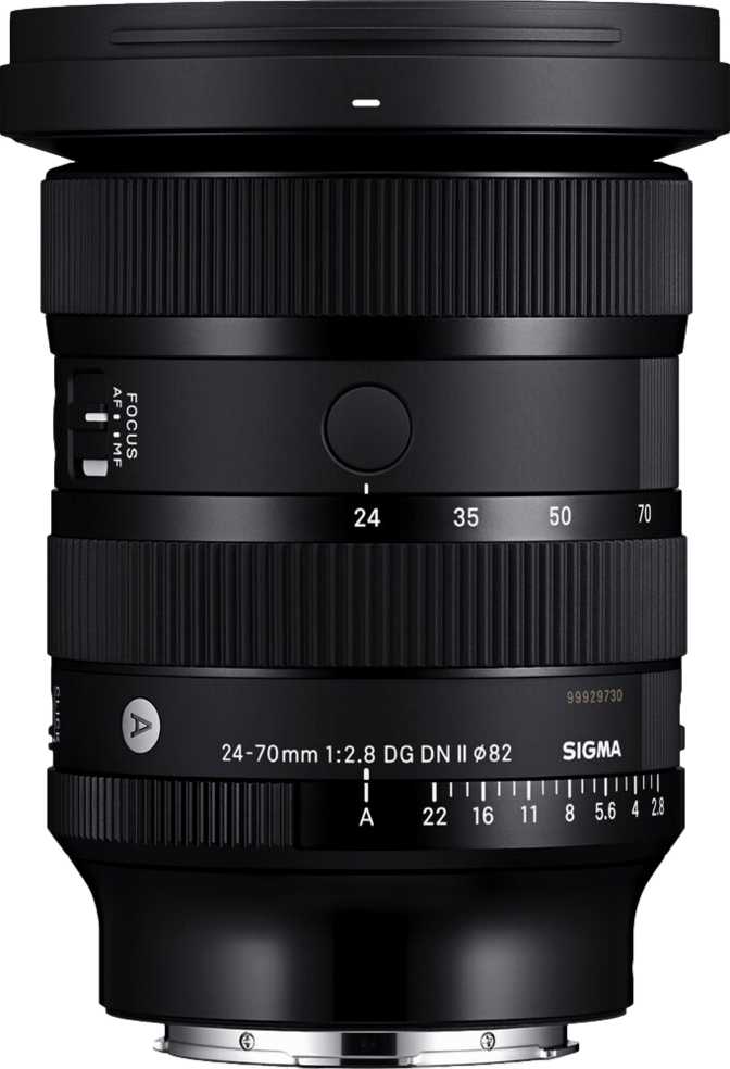
| Sigma 24-70mm f/2.8 DG DN Art | 24–70mm | f/2.8 constant | ~835g | 0.38m |
| Lumix S 24-105mm f/4 Macro OIS | 24–105mm | f/4 constant | ~680g | 0.30m / 0.5x |
Vs. Sigma 24-70mm f/2.8 Art
The Sigma is the logical comparison for buyers considering this lens. It extends to 70mm — genuinely useful for portrait compression that the 60mm end doesn't quite match — and is widely considered one of the optically sharpest zooms available for any mirrorless system. The trade-off is nearly 300 grams of extra weight. For a travel lens or a daily walk-around, that gap is felt in the shoulder, the bag, and the wrist at the end of a long shooting day.
The Panasonic makes sense for photographers who prioritise portability and close-focus capability. The Sigma makes sense for photographers who prioritise the last 10mm of reach and are willing to carry the weight for optically uncompromising results.
Vs. Lumix S 24-105mm f/4
Panasonic's own 24-105mm f/4 offers a significantly wider zoom range — enough telephoto reach to cover most portrait and travel situations comprehensively. The trade-off is one full stop of aperture. In low light or for subject separation, that stop is meaningful and immediately visible in your results.
The 24-105mm is the right choice for photographers who need range above aperture. The 24-60mm f/2.8 is the right choice for photographers who need light-gathering ability and portability above range. Both are well-built lenses — the right answer depends entirely on how you shoot.
Honest Assessment
The weight-to-performance ratio is the headline achievement here. Getting a constant f/2.8 zoom with weather sealing, built-in stabilisation, a silent focus motor, and close-focus capability approaching macro territory in a package under 550 grams is genuinely difficult to find elsewhere on the L-mount platform. Panasonic has produced a lens that serves as a confident daily companion rather than a piece of gear you reach for only on specific occasions.
The macro capability at this aperture class is also worth emphasising. Most f/2.8 standard zooms treat close-focus distance as an afterthought. The 28cm minimum focusing distance gives this lens a creative dimension that distinguishes it from category peers — particularly valuable for travel and lifestyle photographers who want one lens for a wide range of storytelling situations.
The non-rotating front element and included reversible hood reflect attentive design thinking for photographers who rely on polarising filters and need reliable gear management in the field.
Accepting the 60mm long end requires honest self-assessment. If your instinct is always to zoom to the maximum focal length and wish for more, the Sigma 24-70mm Art is worth the extra weight. The 10mm difference from the most common standard zoom range is a real-world limitation that will surface in specific situations: tighter portrait framing from a fixed position, moderate telephoto subject isolation, any context where you want more reach without switching lenses.
At this aperture class and with a built-in stabilisation system, this is a premium-priced lens. It is not a budget entry into the L-mount system. The value case rests on the combination of features and the weight efficiency — if compact design is not a priority for your shooting style, alternatives may deliver more on a single axis for a similar investment.
Questions Real Buyers Ask
Answers to the most common questions before purchasing this lens
The Verdict
The Panasonic Lumix S 24-60mm f/2.8 is not trying to be the sharpest lens on the L-mount platform or the one with the most impressive zoom range. It is trying to be the one you actually reach for every day — the lens that solves the most photographic situations with the least physical burden, without asking you to sacrifice aperture speed to do it.
For travel photographers, hybrid shooters, documentary professionals, and L-mount users building a lean, capable kit, it succeeds on that mandate convincingly. The constant f/2.8 across the entire range, the macro-approaching close focus, the silent motor, the weather protection, and the sub-550g weight form a coherent package that serves a specific photographer's philosophy: less gear, more shooting.
The 60mm long end is a real limitation, and buyers who need telephoto flexibility should consider the Sigma 24-70mm f/2.8 Art or add a dedicated telephoto to the kit. That is not a deficiency of this lens — it is the design trade-off that makes the rest of what it achieves possible. If you are building around an L-mount body and want a single lens that handles the majority of real-world shooting situations with professional capability and a weight you will forget about by mid-morning, this is the most purposeful choice currently available on the platform.