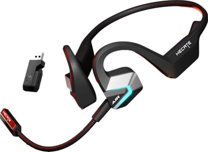
Edifier Hecate Air 3 Commander Review: Open-Ear Gaming Headset
Wireless EarbudsThe wireless gaming headset market has long been dominated by over-ear designs — bulky, isolating, and tethered to a desk. The Edifier Hecate Air 3 Commander challenges that norm with an open-ear neckband form factor paired with genuine gaming-grade connectivity. This is not a lifestyle product wearing a gaming badge. It is purpose-built for players who want situational awareness, all-day comfort, and reliable wireless performance — without surrendering their ears to foam and clamping pressure.
Whether you are commuting between sessions, switching between multiple gaming platforms, or tired of headsets that cause ear fatigue after an hour, the Hecate Air 3 Commander presents a credible case for a different kind of gaming audio. The question is whether the compromises that come with open-ear audio are the right trade for your gaming lifestyle.
Design and Build: A Neckband Headset That Means Business
Form factor, comfort, and construction quality
Form Factor and Fit
The Hecate Air 3 Commander wears its neckband design as a deliberate choice, not a cost-cutting measure. The neckband rests around the back of the neck, with angled earbuds that sit at the outer edge of the ear canal rather than sealing inside it. This is an open-ear configuration — one that lets ambient sound pass through naturally, keeping you connected to your environment whether that is a gaming room, a shared office, or a commute.
At 35 grams total, the headset is light enough that most wearers stop noticing it within minutes. The neckband distributes that weight evenly across the neck and shoulders — fundamentally different from the concentrated pressure of over-ear cups or the insertion fatigue of in-ear tips. For extended gaming sessions or long workdays with background audio, this geometry works firmly in the user's favor.
Wingtips are included in the box, giving wearers an additional way to anchor the earbuds securely to the ear's outer structure. This matters during active use — not just gaming but cooking, walking, or any scenario where head movement could dislodge a less-secured earbud.
Water and Sweat Resistance
The IPX4 rating means the Hecate Air 3 Commander can handle sweat and the occasional splash without concern. This is not a swimming headset or one designed for heavy rain, but it is built to survive the conditions that realistically occur during gaming, exercise, or daily outdoor use. For a neckband gaming product, IPX4 is a sensible and appropriate protection level.
Controls and Microphone Placement
Physical controls are located on the device itself rather than inline on a cable, keeping interaction consistent regardless of how the neckband is worn. Voice prompts provide audio feedback for connection status and battery level, so users never have to guess whether a command registered.
The microphone is removable — a feature more common in over-ear headsets than earbuds. When attached, it positions closer to the mouth for clearer voice capture during calls or in-game communication. The dedicated mute function lets users silence themselves instantly during gameplay without disconnecting from the session.
Audio Performance: What Open-Ear Really Sounds Like
Driver analysis, sound character, and microphone system
Driver and Frequency
Each earbud houses a 16.2mm dynamic driver — considerably larger than the 6mm to 11mm drivers common in most true wireless earbuds. Larger drivers move more air and tend to produce more natural bass extension and spatial width in open-ear configurations, where there is no sealed cavity to create artificial low-end reinforcement. These drivers cover the complete audible spectrum from 20Hz to 20,000Hz — the full range of human hearing.
In an open-ear design, this driver size becomes especially meaningful. Because bass frequencies dissipate without an acoustic seal, a larger driver compensates by generating more physical air movement. The result is audio that feels more present and dimensional than smaller open-ear products, even if deep bass cannot match a sealed in-ear design.
Sound Character and Gaming Context
Open-ear audio blends incoming sound with ambient room noise. For gaming, this is a deliberate trade-off. Shooters and competitive games can benefit from environmental awareness — hearing a teammate call out, noticing someone enter the room, or tracking real-world audio cues that matter mid-session.
There is no active noise cancellation and no passive noise isolation here — by design. Stereo output is present, meaning directional audio — footsteps left, explosions behind — is represented correctly. Spatial audio processing is handled at the platform or software level rather than by the headset itself.
Microphone System
Three microphones work together to capture voice and reduce background noise. The combination of a dedicated noise-canceling microphone array — particularly the removable boom mic — gives this headset a communication quality advantage over earbuds that rely solely on built-in mics.
During gaming, voice chat clarity is functional rather than optional. The boom microphone positions close to the mouth, reducing the pickup of keyboard clicks, fan noise, and ambient room sound that distant microphones inevitably collect. The three-mic setup also provides a usable fallback when the boom is detached.
Connectivity: Dual-Mode Wireless Done Right
Bluetooth 6, 2.4GHz wireless, platform support, and codec reality
Bluetooth 6 and 2.4GHz Wireless
This is one of the Hecate Air 3 Commander's clearest strengths. It supports both 2.4GHz wireless and Bluetooth simultaneously — a connectivity tier that most earbuds and even some over-ear gaming headsets do not offer.
Bluetooth 6 is the latest generation of the standard, bringing improved connection stability and lower overhead compared to previous versions. For everyday use — phone calls, music from a smartphone, switching between devices — Bluetooth 6 handles it efficiently.
The 2.4GHz connection operates via a dedicated USB dongle on a separate wireless channel. This mode is what serious gaming demands: lower latency than Bluetooth, more stable signal in RF-crowded environments like tournaments or apartment buildings, and consistent performance across the full 10-meter rated range. The two modes work in parallel, so a phone and a gaming PC can both be connected at the same time.
Fast Pair and NFC pairing are absent. Connecting a new Bluetooth device requires the standard manual pairing process — holding a button until pairing mode activates, then selecting the device from the host menu. This is normal behavior; the product simply lacks the shortcut conveniences some newer earbuds have introduced.
There is no LDAC, aptX, or any high-resolution Bluetooth codec on board. For gaming, this is largely irrelevant — the 2.4GHz channel handles latency-sensitive content far more effectively than any Bluetooth codec. For audiophile music listening over Bluetooth, users may notice a ceiling on streaming audio quality.
Platform Compatibility
- PC — via 2.4GHz dongle or Bluetooth
- PlayStation — via USB 2.4GHz dongle
- Nintendo Switch — docked mode via USB
- Smartphones & tablets — via Bluetooth 6
Not Supported
- Fast Pair / NFC pairing
- LDAC / aptX / AAC high-res codecs
- LE Audio / Auracast
Battery Life and Charging
Endurance, charging speed, and real-world expectations
Endurance in Real Use
Eighteen hours of continuous playback is a substantial reserve for a product of this size. A user gaming for three to four hours per day would recharge the Hecate Air 3 Commander roughly every four to five days. A more casual user who picks it up for background listening, calls, and occasional gaming sessions might stretch a charge across an entire week.
This capacity is genuinely competitive within the neckband gaming category. It also removes charging anxiety from the equation — unlike truly wireless earbuds where case battery and bud battery both need managing, the Hecate Air 3 Commander stores all its energy in one place and reports its own status through the onboard battery level indicator.
Charging Convenience
USB-C aligns with the current standard across laptops, Android phones, and gaming controllers. No proprietary cables are needed. Fast charging support means a short plug-in window during a meal break or between sessions can recover meaningful playback time without a full recharge cycle. Wireless charging is not supported — not unusual for neckband-form products where coil placement is impractical.
Who Should Buy the Edifier Hecate Air 3 Commander
Matching the right user to the right headset
This headset is built for you if...
-
Multi-platform gamers
You move between PC, PlayStation, and Nintendo Switch and want a single headset that handles all three without adapter juggling.
-
Long-session players
You have experienced ear fatigue or discomfort with over-ear headsets and want a lighter alternative that does not sacrifice mic quality.
-
Home office users who game
You take calls throughout the day, need to hear your environment, and want a capable gaming headset without swapping hardware.
-
Console couch gamers
You want wireless freedom with low-latency 2.4GHz performance and enough range to sit anywhere in a typical living room.
-
Streamers and party chat users
You value microphone clarity and want the professionalism of a removable boom mic in a compact, lightweight package.
You should look elsewhere if...
-
You need noise isolation
You game primarily in noisy environments and need audio isolation to focus. The open-ear design offers none — this is a fundamental form-factor limitation, not a fixable flaw.
-
You are an audiophile music listener
You rely on your gaming headset for primary music listening and require high-resolution codec support like LDAC. Sound quality here serves gaming well, not high-fidelity streaming.
-
You dislike neckbands
The neckband rests on the neck at all times. Some users dislike this form factor entirely, and no amount of adjustment changes that physical reality.
-
You need hardware spatial audio
If you rely on 3D audio processing at the headset level for competitive play, this headset defers that entirely to the platform or host software.
How It Compares to the Alternatives
Edifier Hecate Air 3 Commander vs typical gaming headset categories
| Feature | Hecate Air 3 Commander | Typical Over-Ear Gaming | Typical True Wireless Earbuds |
|---|---|---|---|
| Form Factor | Open-ear neckband | Over-ear circumaural | In-ear true wireless |
| Ambient Awareness | Full (by design) | None without passthrough | Partial (passthrough varies) |
| Session Comfort | High — no clamping pressure | Moderate — heat and pressure | Moderate — tip fatigue |
| Battery Per Charge | 18 hours | 15–30 hours (varies widely) | 5–9 hours (buds only) |
| 2.4GHz Low-Latency | Yes | Yes (common) | Less common |
| Bluetooth Version | 6.0 | Typically 5.x | Typically 5.3–5.4 |
| Removable Boom Mic | Yes | Yes (standard) | Rare |
| Platform Compatibility | PC, Switch, PlayStation | Typically PC + one console | Typically phone-first |
| Noise Isolation | None | High | High (with tips) |
Comparison reflects typical category characteristics, not specific competing models.
Honest Strengths and Weaknesses
A balanced assessment beyond a simple pros and cons list
Where It Earns Your Trust
The Hecate Air 3 Commander earns genuine praise for its connectivity intelligence. Bluetooth 6 paired with a dedicated 2.4GHz channel is not a feature commonly found in open-ear products. Most open-ear earbuds ship with Bluetooth only and aim squarely at fitness or lifestyle markets. Bringing this dual-mode setup to an open-ear neckband gaming product shows intent — Edifier built this for the game, not for the aesthetic.
The removable boom microphone is another differentiation that holds up in practice. Fixed mics on earbuds are convenient but consistently underwhelm in voice clarity. A proper boom mic changes the communication quality tier outright, and the ability to remove it means the headset functions without looking like a call center accessory when mic use is unnecessary.
The 18-hour battery reserve is legitimately useful. Longer battery lives typically require larger enclosures or heavier neckbands, so reaching 18 hours in a 35-gram design reflects solid engineering prioritization. Combined with fast charging via USB-C, the power management story is one of the headset's most practical strengths.
Where It Falls Short
The weaknesses here are structural rather than executional. Open-ear audio will never deliver the immersive, detail-rich experience of a sealed driver against the ear. Bass performance, while aided by the large driver size, will not satisfy users accustomed to over-ear bass response. This is not a flaw in the product — it is an honest consequence of the form factor choice.
The complete absence of noise isolation is a hard constraint — not something firmware or a future update can address. Users in noisy environments who need the game to dominate their audio environment will not get that here. The open-ear design is a commitment to a specific listening philosophy, and it is simply incompatible with isolation-dependent workflows.
The lack of high-resolution Bluetooth codec support is a minor note for a gaming headset but worth flagging for buyers who also rely on the headset for serious music listening. And the 10-meter Bluetooth range, while practical for most setups, is on the conservative end for users with larger open gaming spaces.
Common Questions Answered
What real buyers search for before purchasing
Final Verdict
Our direct purchase recommendation for the Edifier Hecate Air 3 Commander
The Edifier Hecate Air 3 Commander is a well-considered product for a specific user — one who wants gaming-grade wireless performance, genuine microphone quality, and the all-day wearability of an open-ear design without the bulk of a traditional gaming headset. It delivers on those terms with a dual wireless setup that outpaces most of its open-ear competitors, a removable boom mic that lifts communication clarity beyond what earbud mics typically achieve, and enough battery life to make weekly or near-weekly charging the norm rather than a daily obligation.
It is not the right choice for users who need sound isolation, rich immersive bass, or high-fidelity codec streaming. Those are legitimate needs that this form factor cannot satisfy, and buyers should evaluate that honestly before purchasing.