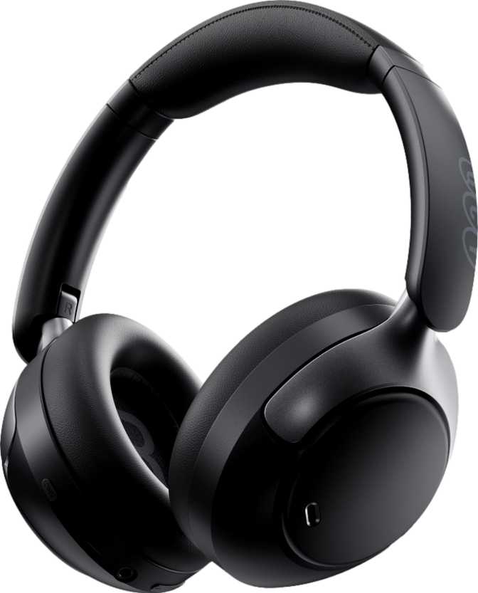
QCY H3 Pro Review: A Budget Headphone With Flagship Audio Ambitions
HeadphonesMost headphones at an accessible price point make a trade: you get one standout feature and accept that the rest of the package is ordinary. The QCY H3 Pro breaks from that pattern. It carries LDAC high-resolution audio streaming and Bluetooth 5.4 — technologies that have historically lived behind significant price barriers — inside a full-size ANC headphone with a battery that could realistically outlast your willingness to listen. Whether the rest of the package justifies the enthusiasm those headline specs generate is exactly what this review examines.
Overall Score
- Battery Life
- 5.0 / 5
- Connectivity & Codecs
- 4.5 / 5
- Value for Money
- 4.5 / 5
- Sound Quality
- 4.0 / 5
- Build & Design
- 3.5 / 5
Build and Design
What the QCY H3 Pro feels like in daily use — and where it makes its physical trade-offs.
At 231 grams, the QCY H3 Pro sits toward the lighter end of the over-ear ANC headphone category. That weight class supports extended wear — a work session stretching from morning through an afternoon of deep focus won't leave your neck fatigued the way heavier headphones can. Still, this is a full-size, closed-back form factor; it's not designed to disappear on your head.
The closed-back construction is a deliberate sonic and practical choice. It keeps your audio contained — your seatmates on a train won't hear what you're listening to — and it creates a physical seal around your ears that contributes to passive noise blocking before any electronic processing engages.
For storage and portability, the H3 Pro folds flat. The hinges compress the earcups inward to reduce footprint, which makes them easier to drop into a bag. Here's the catch: there's no carrying case in the box. A travel bag is conspicuously absent — a meaningful omission at any price point. If protection during travel matters, budget separately for a case.
The cable situation is handled well. The H3 Pro ships with a detachable, tangle-free cable that lets you use the headphones wired without the ongoing frustration of knots. The cable can be replaced if it wears out, which adds genuine long-term value. Cable connections on headphones that don't allow removal eventually create a single point of failure; here, that risk is removed.
-
Over-ear, closed-backBetter isolation; no audio bleed
-
Foldable hingesCompact for bag storage
-
Detachable, tangle-free cableReplaceable; wired connection included
-
231 g — lightweight for over-earSuitable for extended wear sessions
-
No carrying case includedMust purchase a case separately
Sound Performance
A strong specification foundation sets the stage for great audio. Here's what the H3 Pro's driver technology actually means in practice.
Driver and Sensitivity
The H3 Pro uses 40-millimeter dynamic drivers — the standard diameter for full-size over-ear headphones. The sensitivity figure of 112 dB per milliwatt means these drivers produce loud, detailed output from very little electrical input. Your smartphone or laptop drives them without strain, and there's significant headroom before hitting the ceiling of what they can produce.
Impedance sits at 32 Ohms — the sweet spot for consumer devices. No external amplifier is required; these work well straight from a phone's USB-C audio adapter or any laptop output.
Hi-Res Frequency Range
The driver covers 20 Hz to 40,000 Hz. The lower anchor at 20 Hz represents the absolute floor of human hearing — full bass extension with no rolloff of the deepest frequencies. The upper extension to 40,000 Hz exceeds standard CD audio and enters Hi-Res Audio territory.
This upper ceiling becomes most meaningful when paired with LDAC, which transmits high-resolution audio content that theoretically benefits from a driver range wider than standard music requires.
Spatial Audio
The H3 Pro supports spatial audio processing. Based on the specification — there's no mention of gyroscopic sensors or head-tracking hardware — this is software-driven dimensional processing rather than the adaptive, motion-aware spatial audio found in premium flagships.
It widens the perceived stereo field and adds depth cues to standard content. It won't respond to head movements the way hardware-tracked implementations do, but it meaningfully enhances dimensionality for most listening material.
Note on Driver Magnets
Standard dynamic headphone drivers rely on neodymium magnets — a rare-earth material prized for its strength-to-size ratio and efficiency. The H3 Pro's driver specification notably excludes neodymium magnets, which is an unusual choice for a modern dynamic headphone.
This doesn't automatically mean inferior performance, but it's an atypical detail that technically-minded buyers will notice and should weigh against their own listening priorities.
Noise Cancellation and Isolation
The QCY H3 Pro deploys both passive and active noise management — two distinct systems that work together, not as duplicates of each other.
Passive Isolation
The closed-back earcups form a physical barrier against ambient sound when sealed around the ear. This protection exists regardless of whether the electronics are active or the battery is charged — it works in wired mode at zero power. Effective across a broad spectrum of ambient frequencies before ANC even activates.
Active Noise Cancellation
Electronic ANC samples the ambient sound environment and generates opposing signals that cancel incoming noise before it reaches your ears. It excels against consistent, low-frequency sources: airplane engines, subway motors, HVAC systems, highway traffic. Less effective against sudden sounds or spoken voices in close conversation.
Ambient Sound Mode
Inverts the ANC logic entirely. Rather than blocking external sounds, it routes them through the microphones so you can hear your surroundings without removing the headphones. Useful at crosswalks, in retail environments during a commute, or wherever situational awareness matters more than isolation.
Battery Life
The number that separates the QCY H3 Pro from most of its competition — and earns its place as this headphone's headline feature.
The 55-hour battery isn't a marketing rounding of a marginal result — it represents a genuine multi-day listening experience that removes battery anxiety from the equation in a way that most competitors don't. Running without ANC, the H3 Pro delivers roughly a full work week of eight-hour listening days without touching a charger.
Enable ANC and that drops to 40 hours — still enough for four to five full days of continuous use. Many flagship ANC headphones from premium brands deliver 20–30 hours with ANC running. The H3 Pro doesn't just match that category; it meaningfully exceeds it.
Charging uses the universal USB-C standard — no proprietary cable required. The headphones include a battery level indicator so you know where you stand without guessing or opening an app. The one power feature absent is wireless charging; Qi charging pads won't work here.
Battery vs. Category Norms
Averages based on comparable ANC headphones at similar price tiers.
Bluetooth Connectivity and Codec Support
The technical story behind the QCY H3 Pro's wireless capabilities — and why codec support is the single most important reason to consider it.
Bluetooth 5.4
The H3 Pro uses Bluetooth 5.4 — among the most current versions available in consumer audio. Most competing headphones ship with 5.2 or 5.3. The 5.4 revision brings improved connection stability and lower energy consumption from the wireless radio itself. In everyday use, this translates to fewer dropouts and marginally better battery efficiency from the Bluetooth stack.
LDAC Support
LDAC is the centerpiece of the H3 Pro's audio specification. Capable of transmitting audio at up to 990 kbps — roughly three times the data rate of standard Bluetooth audio — it delivers 96kHz/24-bit audio wirelessly at its maximum quality setting. This is Hi-Res Audio over Bluetooth.
At this price point, LDAC access is genuinely rare. To use it, your source device must support it. Android devices running version 8.0 or later typically support LDAC natively.
Multipoint and Range
The H3 Pro supports simultaneous pairing with two devices. A laptop and a phone can both maintain active connections — when a call arrives on your phone while music plays from your laptop, the headphones switch audio automatically.
Bluetooth range is specified at 10 meters under ideal conditions. Adequate for desk use, but conservative compared to headphones claiming 30-plus meters. In interference-heavy environments, users may feel this limit more than the spec implies.
Codec Compatibility at a Glance
| Codec | QCY H3 Pro | Quality / Data Rate | Device Compatibility |
|---|---|---|---|
| LDAC | Up to 990 kbps — highest available | Android 8.0 and later | |
| AAC | High quality — Apple's standard | iPhone, Mac, and Android | |
| SBC | Standard — universal fallback | All Bluetooth devices | |
| aptX / aptX HD | Not available | — | |
| aptX Adaptive | Not available | — | |
| aptX Low Latency | Not available — relevant for gaming | — | |
| LHDC / LE Audio | Not available | — |
Call Quality and Microphone System
The H3 Pro doubles as a capable headset. Here's what its three-microphone system delivers — and one notable gap for meeting-heavy users.
The H3 Pro is equipped with three microphones configured for call use. Multiple microphones in a headset context typically serve two functions: primary voice pickup and noise rejection. The arrangement here suggests a beamforming or array configuration intended to isolate your voice while suppressing background noise.
The microphone system includes noise cancellation processing specifically for calls, which reduces the ambient noise that reaches the person you're speaking with. For video meetings, voice calls, and remote work, this is a practical feature that changes the quality of calls in noisy environments — home offices, co-working spaces, or commute calls.
The headphones can function as a full headset for voice communication across computers and phones, making them a dual-purpose productivity and entertainment device without requiring a mode switch or additional accessory.
Microphone Specification Summary
- 3-microphone noise-canceling array
- Call noise suppression processing active
- Headset-compatible for computers and phones
- No dedicated hardware mute button
Controls, Features, and Day-to-Day Usability
How the QCY H3 Pro behaves in daily use — the things that matter once the honeymoon period ends.
On-Device Control Panel
Controls are located directly on the ear cup — a clean design choice. There's no cable-mounted remote to fumble for, and controls are always in the same location relative to your head, whether you're using the headphones wired or wirelessly. Wired users also rely entirely on the earcup buttons for playback management, since there's no in-line control panel on the cable.
Dual-Device Multipoint
The H3 Pro supports simultaneous connection to two devices. Both a laptop and a phone can maintain active pairings at once. When a call arrives on your phone while music plays from your computer, the headphones switch audio streams automatically. For desk workers who juggle a personal phone and a work computer, this changes the daily experience in a way that quickly becomes indispensable.
Who Should Buy the QCY H3 Pro
The H3 Pro is built for a specific buyer type. Whether you're in that group determines whether it's the right call or the wrong one.
Built For
-
Android users who want LDAC — Subscribers to Tidal, Amazon Music HD, Qobuz, or anyone storing FLAC files locally. This is one of the only headphones at its price tier that makes Hi-Res wireless audio accessible without paying flagship prices.
-
Remote and hybrid workers who need a reliable ANC headset with multi-day battery life and a noise-canceling mic array for frequent video meetings.
-
Daily commuters who rely on ANC for public transit, want ambient mode for situational awareness, and need a headphone that doesn't demand mid-week charging.
-
Frequent device switchers who juggle a laptop and a phone and want multipoint pairing to handle transitions automatically without manual reconnection.
-
Budget-focused audio enthusiasts who want current-generation Bluetooth 5.4, LDAC codec access, and a genuine ANC system without paying premium brand prices.
Not Right For
-
Gym users and outdoor athletes — the complete absence of any water or sweat resistance rating makes this a poor fit for exercise environments. Even moderate sweat exposure creates genuine hardware risk.
-
Gamers needing low-latency audio — 60 milliseconds of wireless latency introduces noticeable desync in competitive and rhythm-based gaming contexts.
-
iPhone users expecting full codec access — AAC is supported and solid, but the LDAC capability that defines this headphone's value proposition is Android-only. iPhone users don't access the premium codec.
-
Travelers who want everything in the box — no carrying case is included. The foldable design provides partial portability, but protection during travel requires a separately purchased case.
-
Meeting-heavy users who need quick mute — no hardware mute button means every mute action goes through software. Minor friction that accumulates in workflows with frequent mute/unmute cycles.
How It Stacks Up
The QCY H3 Pro vs. what buyers typically encounter at a comparable price tier. The pattern is consistent: leads on audio specs and endurance, concedes accessories and protection.
| Feature | QCY H3 Pro | Typical Budget ANC Competitors |
|---|---|---|
| Battery — ANC off | 55 hours | 25–40 hours |
| Battery — ANC on | 40 hours | 20–30 hours |
| Bluetooth version | 5.4 | 5.2–5.3 |
| LDAC support | Rarely available at this price | |
| AAC support | ||
| Multipoint devices | 2 devices | Often 1 device |
| ANC + Ambient mode | Common at this tier | |
| Charging port | USB-C | Usually USB-C |
| Water resistance | IPX4 on some models | |
| Travel case included | Occasionally included | |
| Hardware mute button | Inconsistent across models | |
| Auto-pause (in-ear detection) | Inconsistent across models |
The Honest Take
Where the QCY H3 Pro earns genuine respect — and where it makes trade-offs that aren't negotiable.
Where It Earns Respect
The QCY H3 Pro does something genuinely unusual: it brings LDAC — a codec previously gated behind expensive flagship hardware — into an accessible price bracket. Paired with Bluetooth 5.4 and a battery that lasts longer than most people will manage in a single stretch, the technical foundation here is strong enough to make audiophiles take notice.
The 55-hour battery is not a marketing rounding of a marginal result. It represents a genuine multi-day listening experience that removes battery anxiety from the equation in a way that most competitors don't. Forty hours with ANC running puts it ahead of what many premium headphones claim to offer.
The multipoint pairing and three-microphone call setup make the H3 Pro credible as a daily work headset, not just a music device. For the right user, it handles both roles without asking you to buy two products.
Where It Compromises
The lack of water resistance is a genuine constraint that removes gym and outdoor use from the picture entirely. The absence of an included case means buyers need to factor in a separate purchase if protection during travel matters. The missing hardware mute button is real friction in meeting-heavy workflows.
The auto-pause function that many users rely on for quick headphone removal is absent. The 10-meter Bluetooth range is conservatively stated, and real-world use in office buildings with walls and interference may feel limiting for users accustomed to headphones that claim 30-plus meter range.
The driver specification's departure from standard neodymium magnets is the one technical detail that careful spec-readers will look at twice. The sensitivity numbers on paper look fine, but the atypical choice is worth knowing before committing.
Buyer Questions Answered
The questions real buyers search for before committing — answered directly.
Final Verdict
The QCY H3 Pro earns a clear recommendation for a specific, well-defined type of buyer: someone on Android who wants LDAC wireless audio quality, needs ANC for daily commuting or desk work, and values a battery that genuinely lasts multiple days without requiring thoughtful charging management. For that person, this headphone offers capabilities that have historically required significantly more investment.
The weaknesses — no water resistance, no carrying case, no auto-pause, no hardware mute, conservative Bluetooth range — are real and collectively shape who this headphone is suited for. None are fatal; all are worth knowing before buying.
For the audio-conscious commuter, the remote worker, or the listening enthusiast who wants access to high-resolution wireless audio without paying flagship prices, the QCY H3 Pro is a technically honest, overperforming value. It earns its place in the conversation precisely because it delivers — on the specifications that matter most to audio-focused daily listeners — more than its price bracket has historically offered.