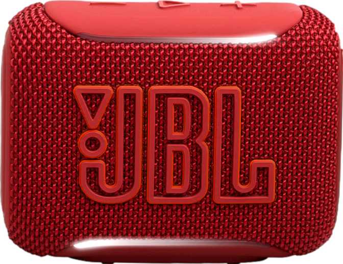
JBL Go 5 Review: A Pocket Speaker That Earns Its Reputation
Portable SpeakersThe ultra-portable Bluetooth speaker market is one of the most crowded shelves in consumer audio. At the compact end of that shelf sits the JBL Go 5 — a speaker small enough to slip into a jacket pocket or clip onto a backpack, yet engineered to survive conditions that would kill most of its rivals. Whether that value proposition fits your life depends entirely on what you need a small speaker to do, and this review lays that out without ambiguity.
Build Quality and Physical Design
Durability, form factor, and everyday handling
A Speaker Built to Be Ignored (In a Good Way)
The Go 5 is designed to go places without asking for special treatment. Its IP68 certification is the headline — and it means more than the vague "water-resistant" language plastered on competing products. IP68 is a full-immersion waterproof and complete dust-proof rating, the highest available for consumer electronics. Pool deck, beach bag, muddy hiking pack — these are environments it handles without complaint.
At 230 grams, the speaker sits in the hand with a presence that does not feel cheap, but will not fatigue a wrist or weigh down a bag. The footprint — roughly 10 cm wide, 7.7 cm tall, and just over 4 cm deep — makes it genuinely pocketable for most jacket or cargo pockets without the audio compromise of truly tiny speakers.
Physical controls sit directly on the device body. There is no touch interface, no remote, and no RGB lighting — JBL has kept the design deliberate and uncluttered. Tactile buttons can be operated by feel alone, which matters when the speaker is buried in a bag or used outdoors with wet or gloved hands.
| Height | 77.4 mm |
| Width | 101 mm |
| Depth | 43 mm |
| Weight | 230 g |
| IP Rating | IP68 — Full Submersion |
| Controls | On-device physical buttons |
| Travel Bag | Not included |
| Charging Port | USB-C |
Sound Performance: Setting Honest Expectations
Output power, frequency range, and real-world audio character
What 4.8 Watts Actually Sounds Like
The Go 5 drives a single audio output at 4.8 watts. In practical terms: it is more than enough to fill a bathroom, a small bedroom, or a quiet outdoor space. It is not enough to compete with ambient noise at a beach gathering or provide background music for a garden party. Think of it as personal listening made slightly social — one to four people within a few metres, in a reasonably quiet environment.
The speaker uses a single driver in a mono configuration. There is no stereo pairing capability, meaning two Go 5 units cannot be linked to create a left-right stereo image. What you hear is a centred, combined sound presentation at all times.
Frequency Range and Audio Character
The Go 5 reproduces sound from 100 Hz at the low end up to 19,000 Hz at the top. The lowest notes of a bass guitar sit around 40–80 Hz, and the cut-off at 100 Hz means the deepest bass frequencies are simply absent. Low-mid bass — the warmth and punch of music — is present, but sub-bass rumble is not a characteristic this speaker can deliver.
There is no passive radiator, so what you hear is clean, honest reproduction within its natural range rather than boosted or exaggerated bass. The upper end extending to 19,000 Hz covers nearly the full range of human hearing, meaning treble detail and vocal presence are well-served. The maximum output of 85 dB is solid for the speaker's size — clearly audible at the distances this speaker is designed for.
Genre Compatibility at a Glance
- Podcasts & Audiobooks — excellent vocal clarity
- Acoustic & Vocal Music — natural, comfortable reproduction
- Pop & Rock — well-suited within its volume range
- Classical — good treble extension, clean midrange
- Hip-Hop & EDM — missing sub-bass will be immediately noticeable
- Bass-heavy Electronic — limited low-frequency output is a real constraint
Connectivity: Where the Go 5 Punches Above Its Weight
Bluetooth 6.0, multipoint pairing, AAC, and Auracast explained
Bluetooth 6.0 — What It Means in Practice
The Go 5 ships with Bluetooth 6.0, the current leading edge of the standard. For everyday users, this translates to improved connection stability, lower power consumption during transmission, and better handling of crowded wireless environments — airports, offices, and public spaces where dozens of Bluetooth devices compete for the same radio spectrum. Practical range extends to around 10 metres, standard for this category and sufficient for most room-to-room use.
Two Devices Connected Simultaneously
Multipoint connectivity supports two paired devices at once, meaning a phone and a laptop can both stay connected without manual switching. When audio starts on the second device, the speaker transitions automatically. Many speakers at this price tier skip this feature entirely — its inclusion here is genuinely useful in daily workflows.
AAC and Auracast
AAC codec support means iPhone and iPad users streaming audio receive a noticeably cleaner wireless signal than they would over the default Bluetooth codec. Android users without AAC-capable apps default to standard SBC — functional but not optimal. There is no aptX, aptX HD, or LDAC support.
Auracast is the more forward-looking inclusion. This new Bluetooth broadcast technology allows a single audio source to be shared simultaneously with multiple nearby Bluetooth receivers without individual pairing. It is early-generation in terms of ecosystem support, but its presence signals that JBL is building the Go 5 for relevance beyond a single product cycle.
Full Connectivity Breakdown
- Bluetooth 6.0— latest generation standard
- Multipoint (2 devices)— simultaneous connection
- AAC Codec— optimised for Apple devices
- Auracast— next-gen broadcast sharing
- USB-C Charging— modern universal standard
- No NFC Pairing— manual pairing required
- No aptX / LDAC— Android codec support limited
- No AUX / 3.5mm Input— wireless only
- No Wi-Fi— Bluetooth-only connectivity
- No Wireless Charging— cable required to charge
Battery Life: Reliable for a Day Out
Endurance, charging, and power-related features
The internal battery delivers approximately eight hours of playback. At moderate volume in typical conditions, most users will get through a full day of casual listening on a single charge — a beach trip, a work-from-home session, or an outdoor afternoon. Heavy users who push the volume or run it as near-constant background audio across a long day may find themselves reaching for the USB-C cable before bedtime.
What the Go 5 does not do: it cannot charge other devices. It functions purely as an audio device and not as an emergency power bank for a phone. Wireless charging is also absent — topping up requires a cable connection.
The sleep timer feature is a practical addition for bedside or desk use, automatically shutting the speaker off after a set period rather than draining the battery overnight. A battery level indicator removes the guesswork from knowing when to plug in.
- Battery level indicator included
- Sleep timer for overnight use
- USB-C charging port
- No power bank function
Who the JBL Go 5 Is For — and Who It Is Not
Ideal use cases and clear limitations
- Commuters and travellers
Background music or podcast audio in hotel rooms, bathrooms, and office desks.
- Outdoor and active users
Genuine IP68 water and dust protection without any worry about a ruined speaker.
- Simple setup seekers
No apps, no voice commands, no companion software — just pair and play.
- iPhone and iPad users
AAC codec support delivers better wireless audio quality on Apple devices.
- Pocket-first buyers
Those who value true portability and will not miss stereo imaging.
- Louder, room-filling output
Not designed for parties, outdoor gatherings, or environments with ambient noise.
- Bass-heavy music listening
The low-frequency limitation will frustrate hip-hop and EDM listeners immediately.
- Stereo sound from one unit
No stereo pairing — two Go 5s cannot link for left-right audio separation.
- Android audiophile codec support
No aptX or LDAC — Android streaming defaults to SBC.
- All-day heavy listening
Heavy users may find the eight-hour ceiling tight for very long days.
How the JBL Go 5 Compares to the Competition
Competitive positioning against typical entry-level compact Bluetooth speakers
| Feature | JBL Go 5 | Typical Entry Competitors |
|---|---|---|
| IP Rating | IP68 — Full Submersion | Often IP67 or IPX5–IPX7 |
| Bluetooth Version | 6.0 | Usually 5.0–5.3 |
| Multipoint Devices | 2 Devices | Varies — often 0 or 1 |
| Auracast | Rare at this size and price | |
| Stereo Pairing | Some rivals support it | |
| AAC Codec | Varies by model | |
| Battery Life | ~8 Hours | Typically 6–12 hours |
| Charging Port | USB-C | USB-C increasingly common |
| Voice Assistant | Rare at this tier |
The Go 5's IP68 rating and Bluetooth 6.0 stand out clearly at this size class. Its stereo pairing absence is a genuine disadvantage compared to rivals that offer left-right speaker linking. If stereo pairing or deeper bass is a priority, models with passive radiators and stereo-link support deserve consideration first.
Strengths and Weaknesses, Honestly Assessed
A balanced editorial view beyond a simple pros and cons list
The Go 5 earns its strongest marks where outdoor and travel use cases are concerned. The IP68 certification is not a marketing claim dressed up with caveats — it is a genuine full-immersion rating that few speakers this compact can match. Combine that with Bluetooth 6.0's connection resilience and the two-device multipoint convenience, and the technical foundation here is more sophisticated than the modest size suggests.
The Auracast inclusion is a forward-thinking addition that currently has limited practical utility — few other devices support the standard at the moment — but it is a feature that becomes more useful as the broader ecosystem catches up. Buyers who invest in this speaker now are not committing to an obsolete connection standard.
The honest limitations are real. The mono output is the most significant. In a product category where rivals increasingly offer stereo speaker pairing, the Go 5 makes no concession to spatial audio. For music listeners who value width and separation in their sound, this is not a small compromise — it defines the entire listening experience. The bass response ceiling is similarly non-negotiable; there is no EQ setting or firmware update that will manufacture frequency extension the hardware simply cannot produce.
At 4.8 watts, the Go 5 knows its room. It is not designed to be the loudest speaker you own — it is designed to be the speaker you actually carry everywhere without thinking twice about it.
Where It Excels
- IP68 — the best protection available for consumer electronics
- Bluetooth 6.0 with stable connection in crowded environments
- True pocket-size form factor without audio compromise
- Multipoint two-device pairing for seamless daily workflows
- Auracast support for future-ready connectivity
Where It Falls Short
- Mono output only — no stereo pairing capability whatsoever
- Bass response limited — sub-bass frequencies are simply absent
- 4.8W maximum — not suited for loud environments or group listening
- No aptX or LDAC for Android high-quality audio codec support
- Eight-hour battery may not reach a full heavy-use day
Common Buyer Questions Answered
Real questions from real buyers — answered directly
Should You Buy the JBL Go 5?
The JBL Go 5 is a focused, honest product. It does not try to be everything — it tries to be the most durable, well-connected pocket speaker available at its size, and it largely succeeds at that specific ambition.
If your use case is personal listening across a range of environments where portability and resilience matter more than room-filling sound, the Go 5 delivers confidently. The IP68 protection, Bluetooth 6.0, and two-device multipoint connectivity represent genuinely useful engineering in a package smaller than a sandwich.
If you need deep bass, stereo imaging, long battery endurance, or the ability to fill a large outdoor space with sound, the Go 5 will leave you wanting. These are not flaws — they are category boundaries. The speaker knows what it is.
You want a compact, nearly indestructible Bluetooth speaker for everyday personal use, outdoor adventures, and travel. Best enjoyed with acoustic, vocal, pop, or rock music, and ideal for podcast and audiobook listeners.
Audio fidelity, bass response, stereo imaging, or volume output are your primary criteria. Bass-heavy music genres and group listening scenarios will consistently hit the hardware ceiling.